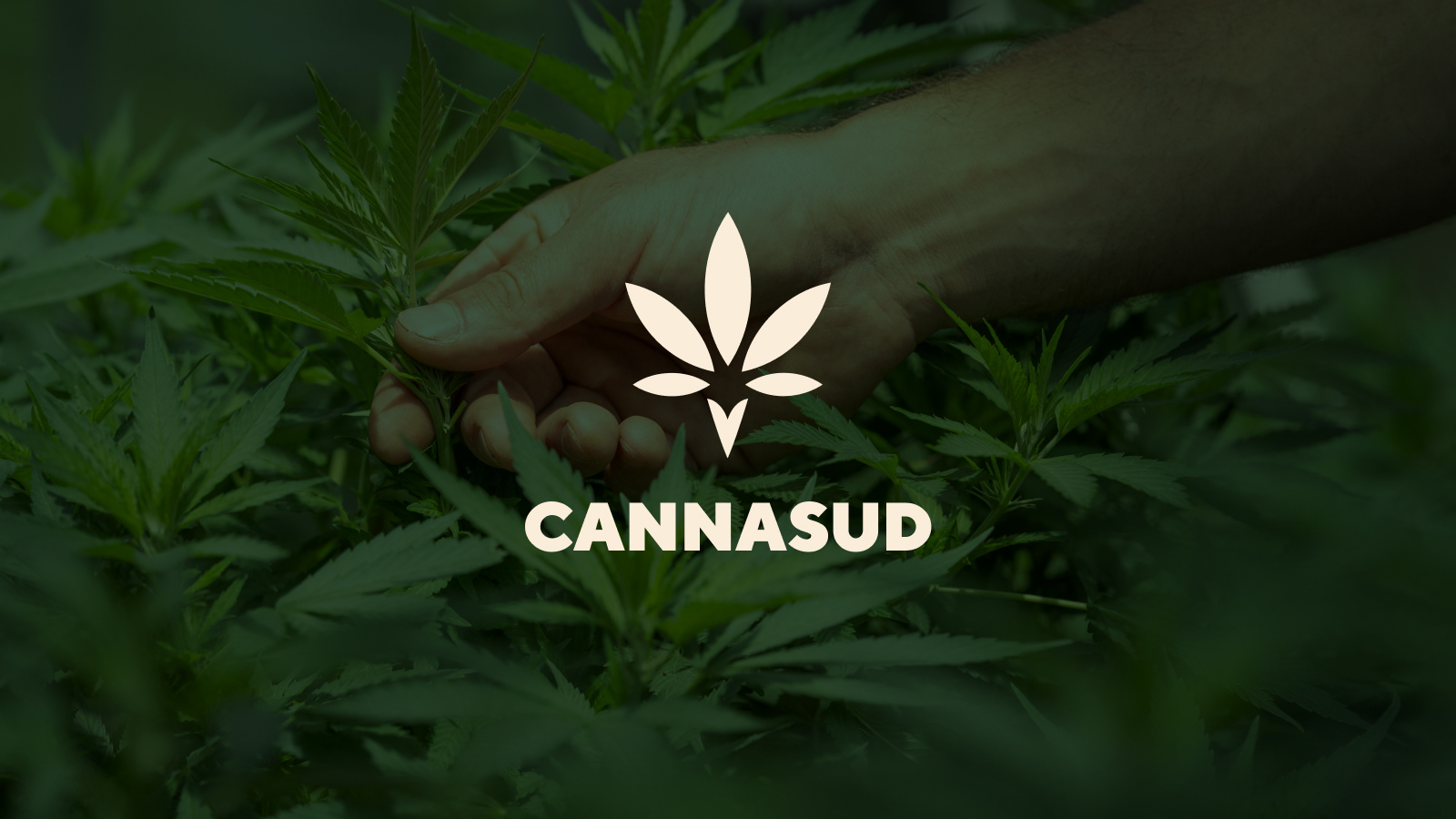
Cannasud Brand
The growth trend in investment, consumption, and uses in cannabis in the last years has been exponential, exceeding most expectations. The worldwide legal cannabis industry generated billions.
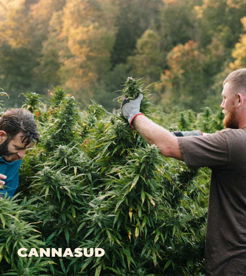
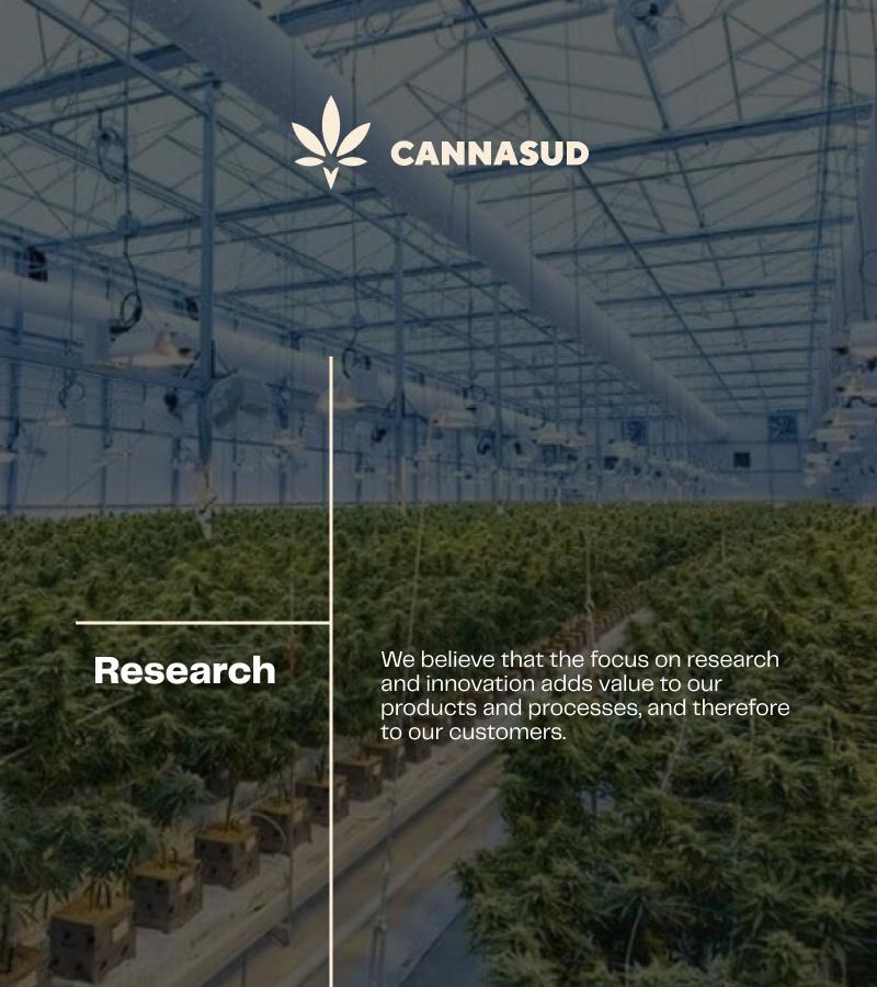
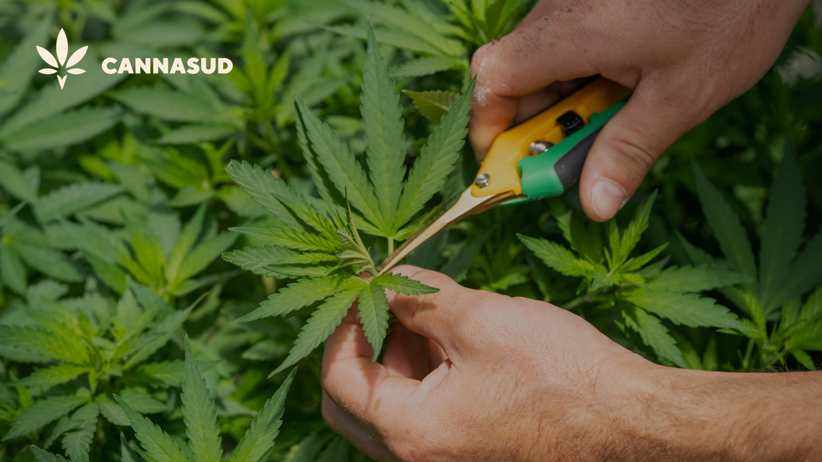
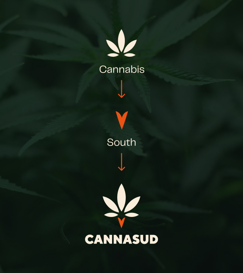
The cannabis legal market is composed of two segments, the medical and the recreational use, Cannasud was born to represent the Southern Lands for Medical purposes.
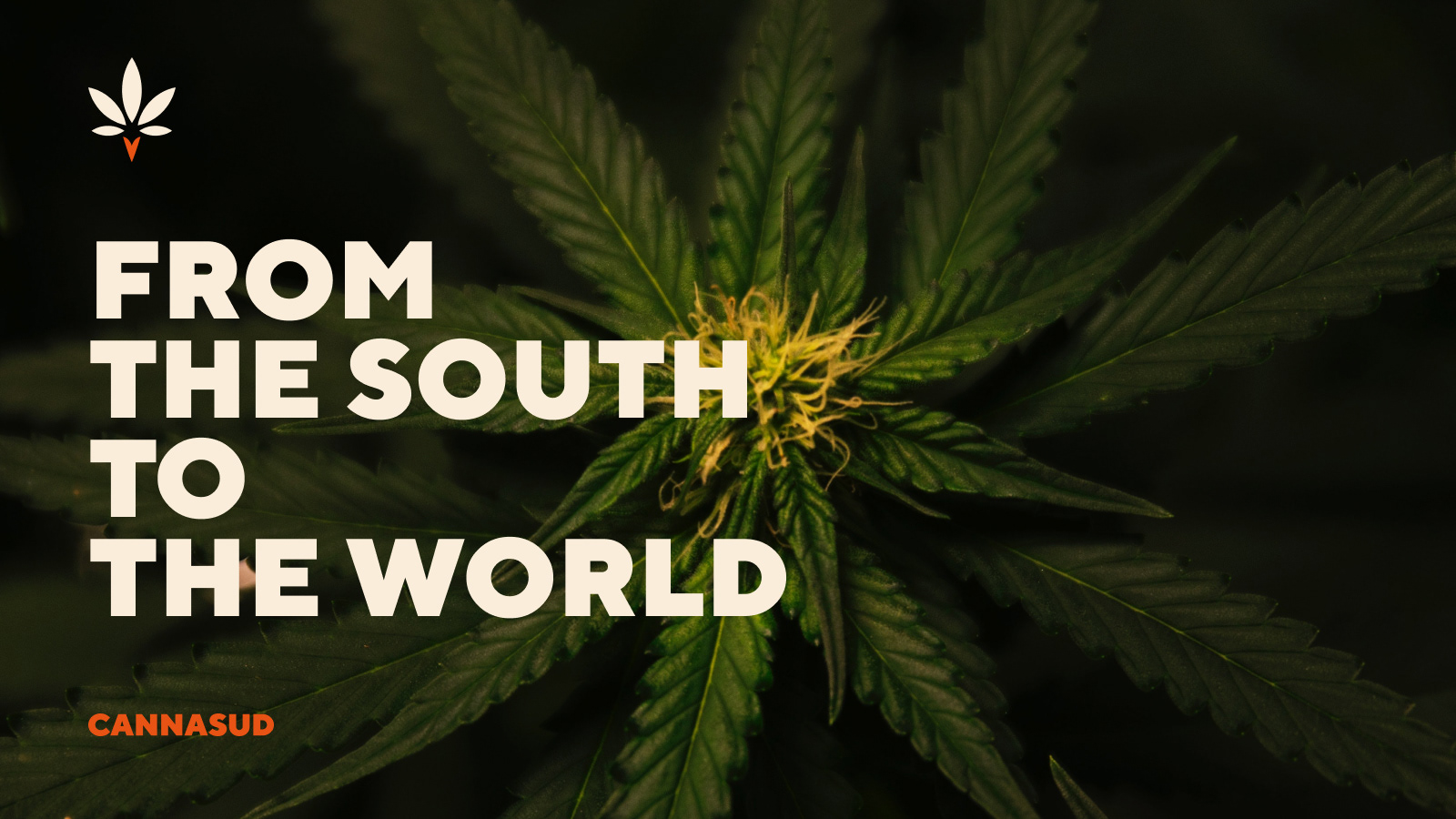
They approached us in need for a brand so we worked together with them from scratch providing naming and branding services. Cannasud was happily born. The've been exporting medical cannabis to the world since then and we're happy to help them grow day by day.
Concept
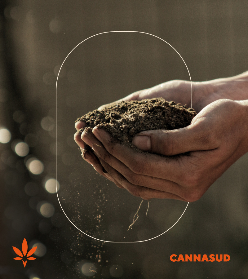
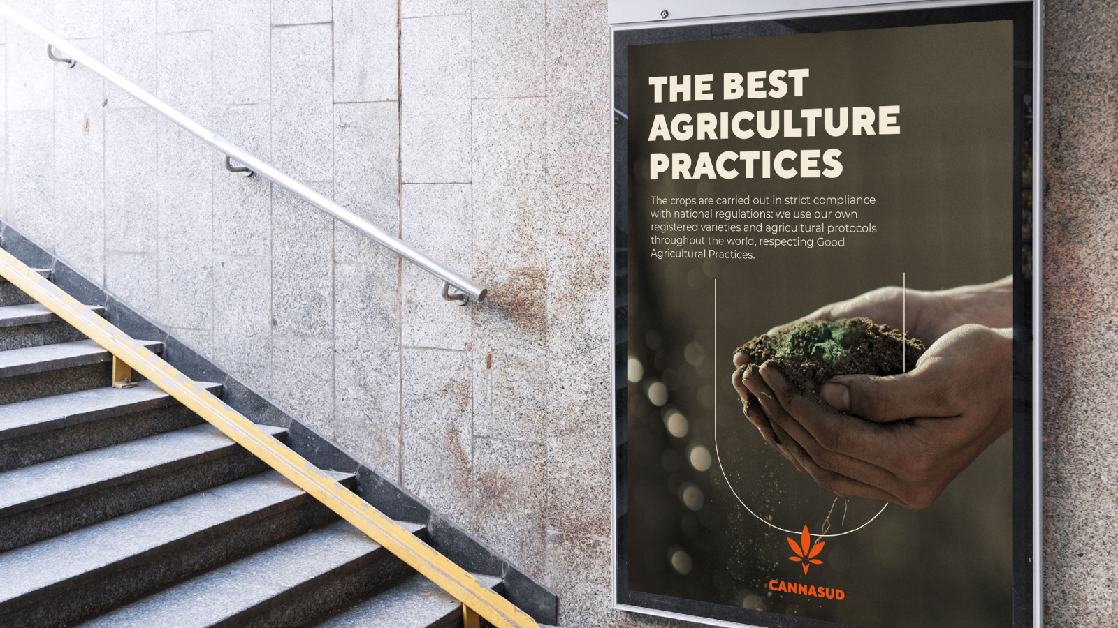
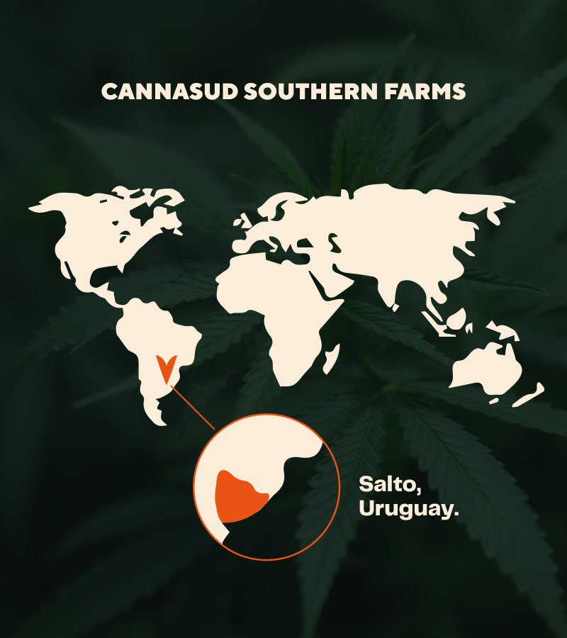
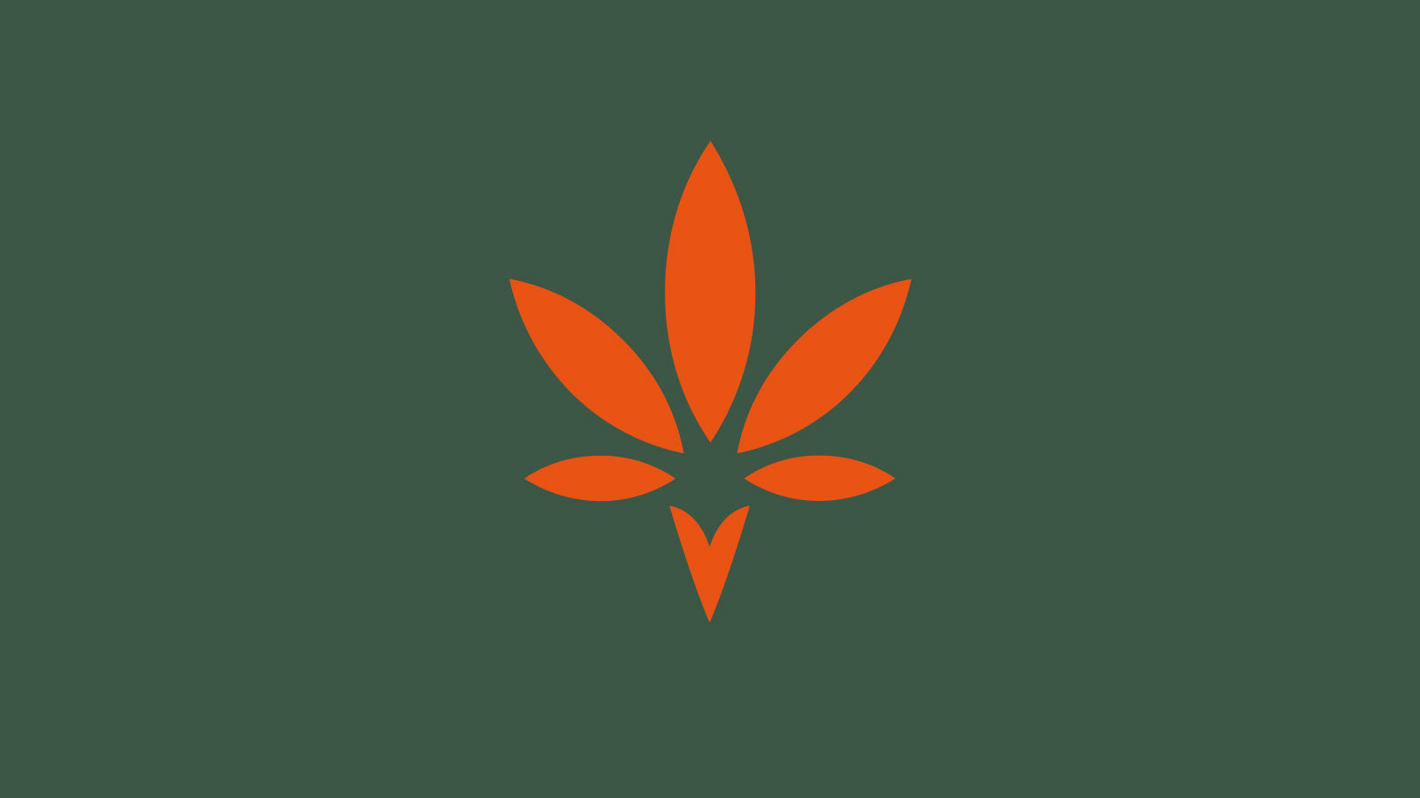
It's important to come up with a concept that represents the company values and ideas, and for them it was very important to stand apart form their northern competitors, they wanted everyone to know that the product came from South America, specifically from Uruguay.
We came up with the idea of merging what they do, and where the do it, and worked out beautifully. From there onwards the brand kept expanding and a brand spectrum was developed.

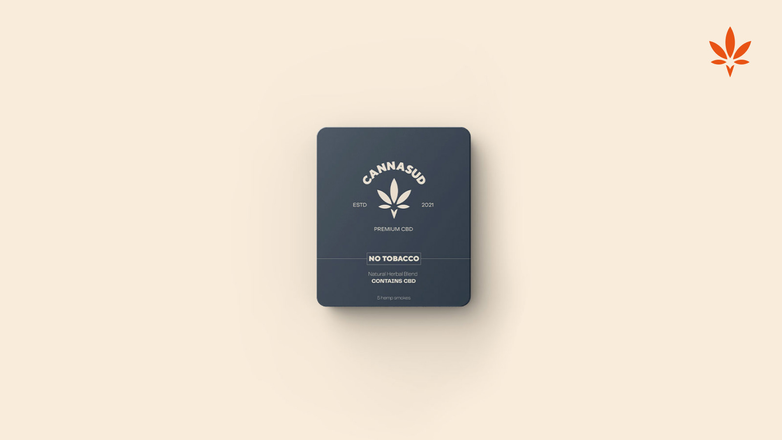
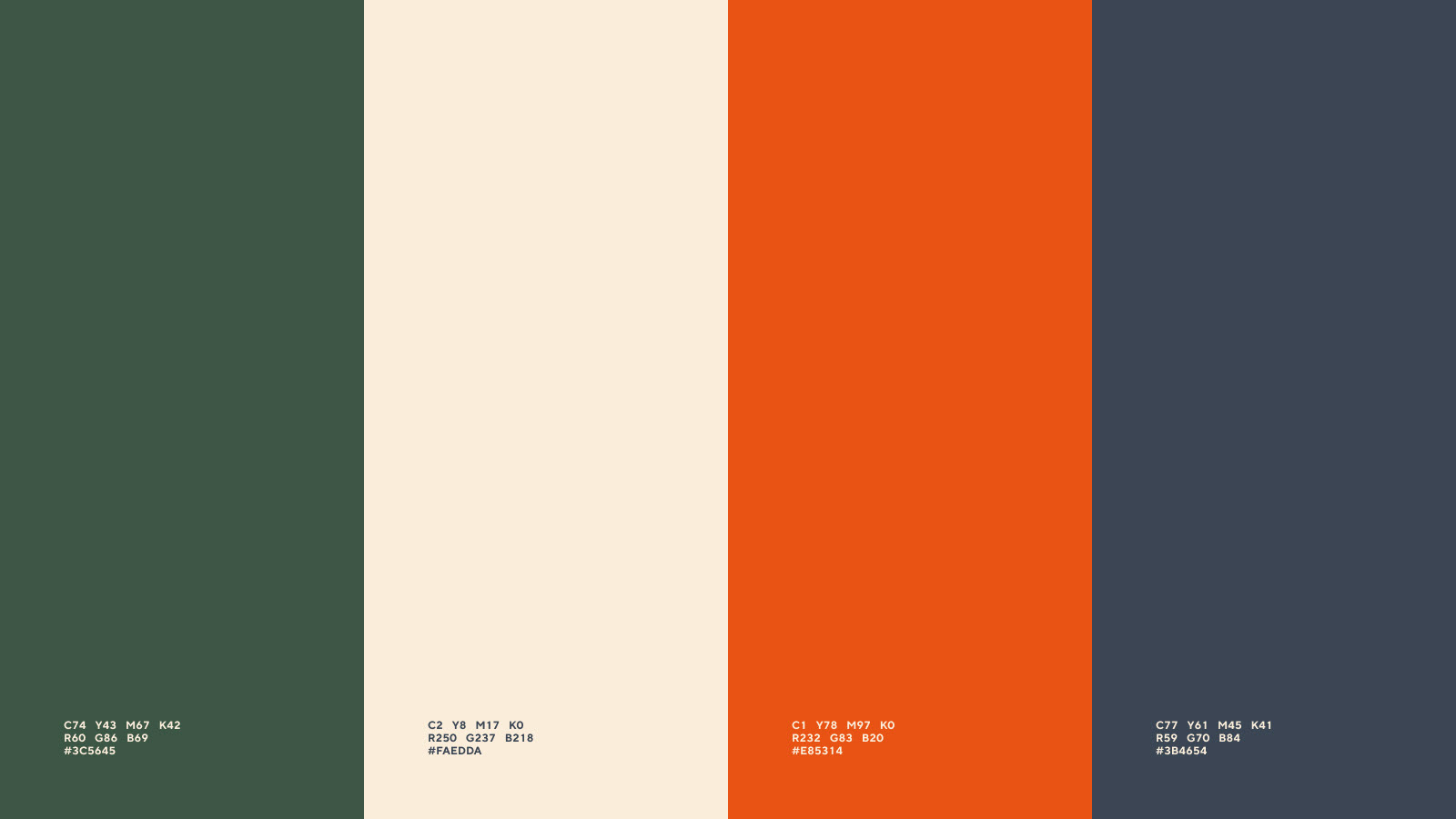
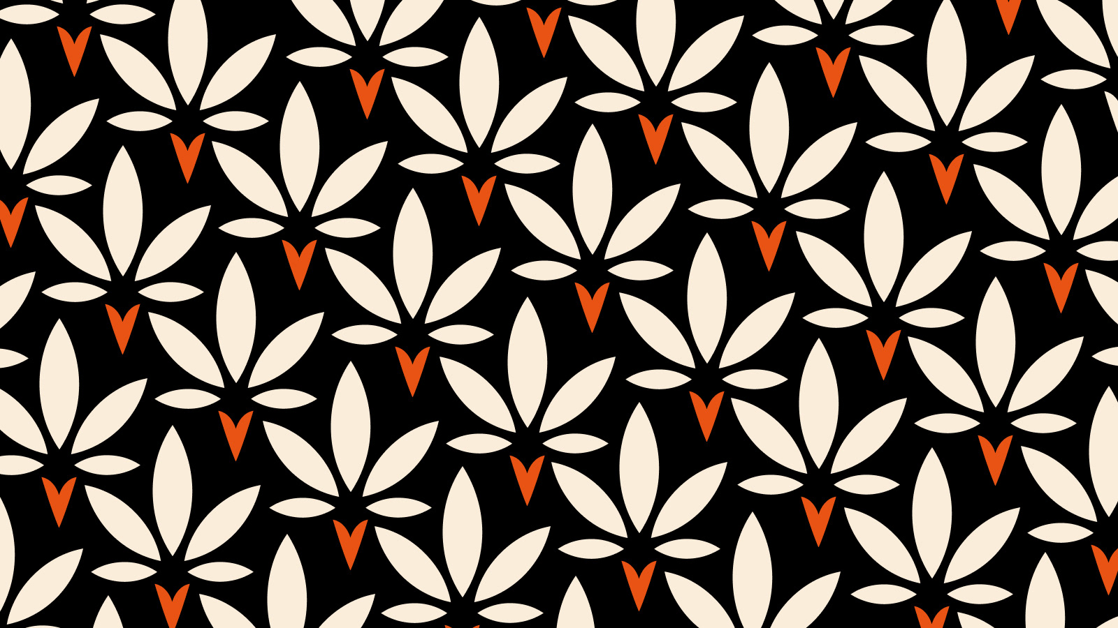
Color Palette
We didn't want to use the classic colors associated with the Cannabis world, because they are here for something much serious, they want to be leaders on the Medicinal Marihuana branch. That's why we approached color palette from a different point of view resulting in this harmonic pattern of colors that have the cannabis and corporate vibe.
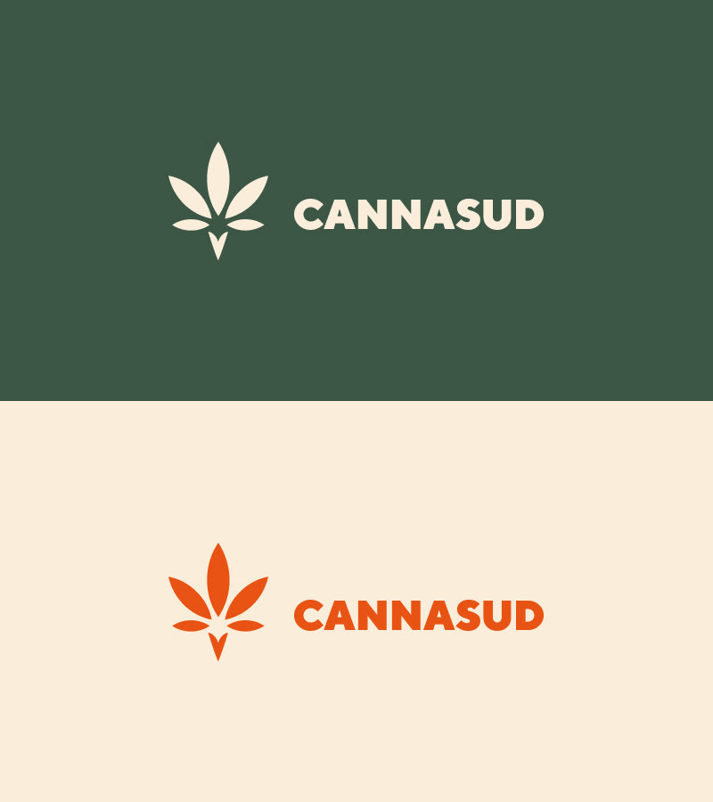
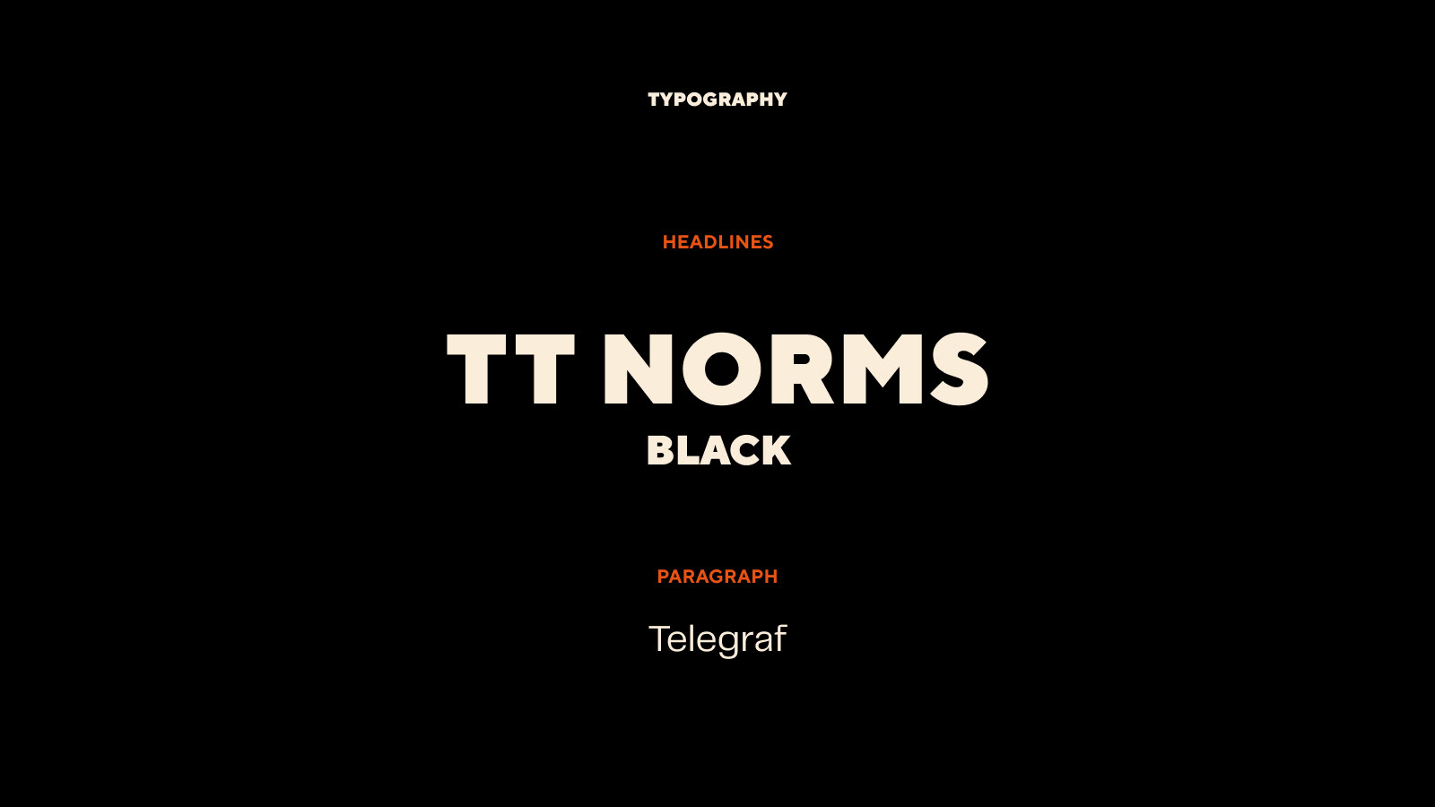
Voice Matters
In the design world typography is similar to the "voice" a person has. When looking for Cannasud's voice, we centered on a simple but powerful tone. After lots of tests we found a combination that got it just right.
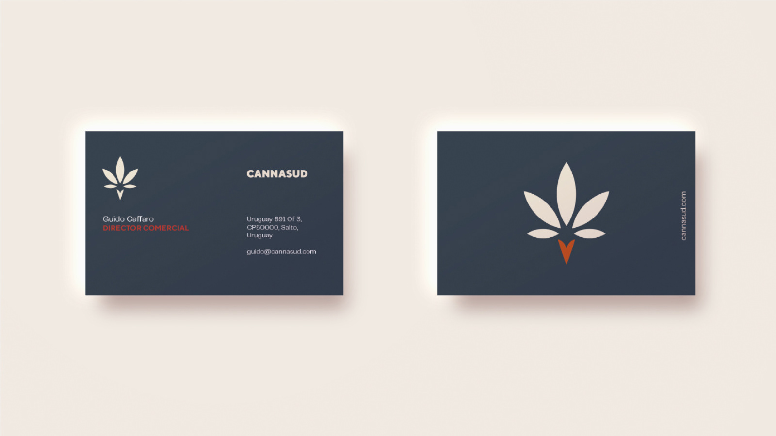
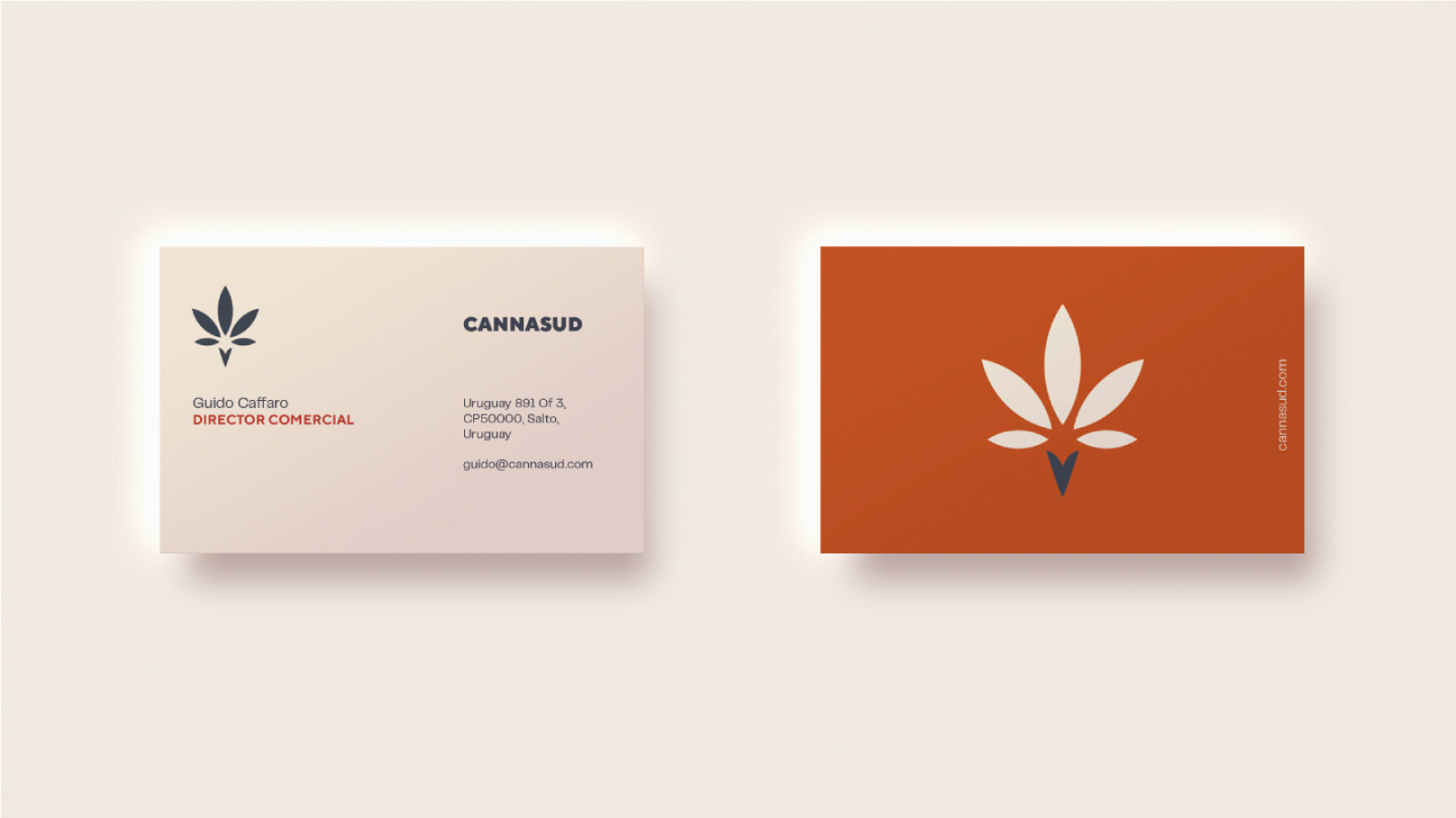

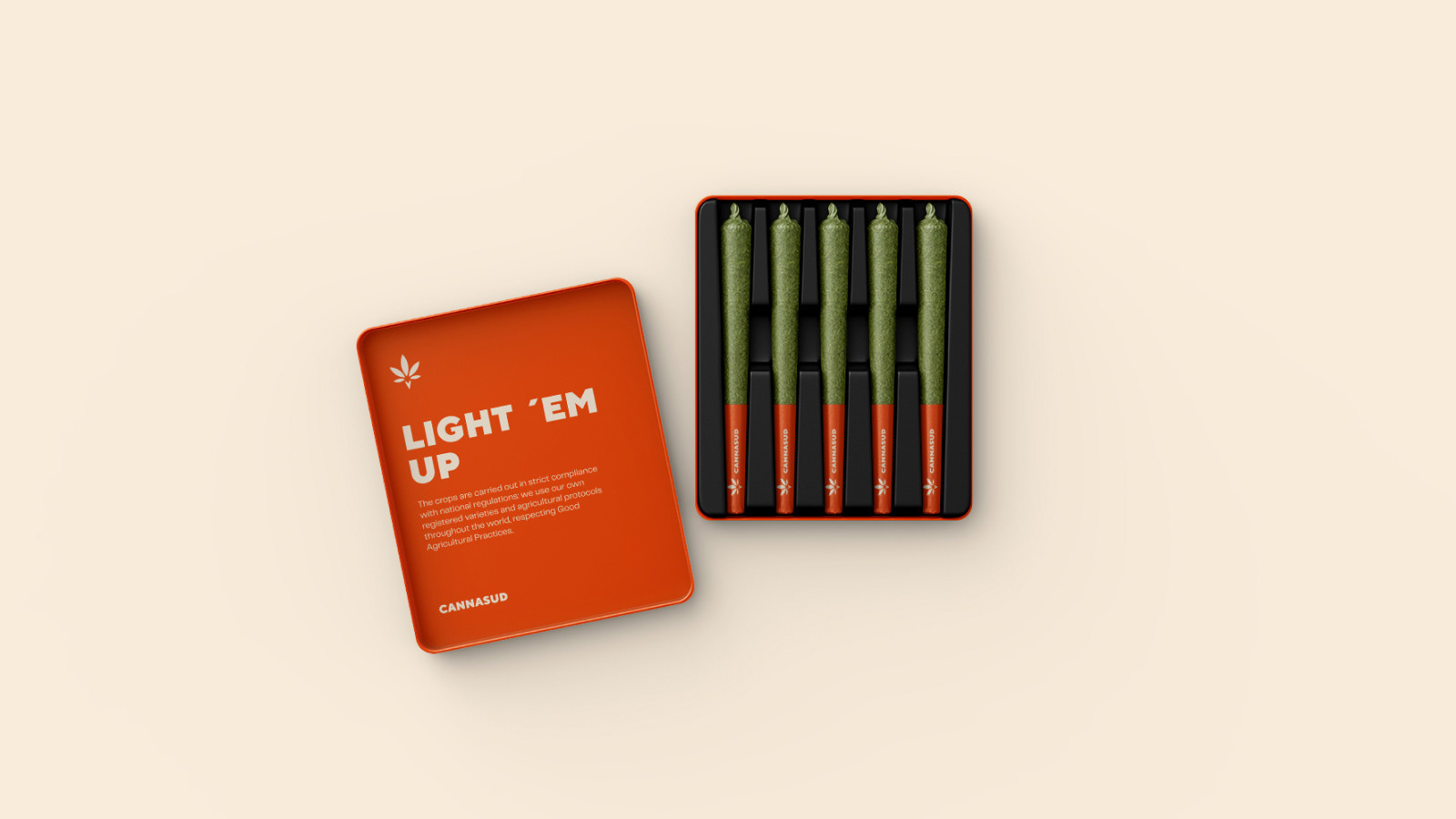
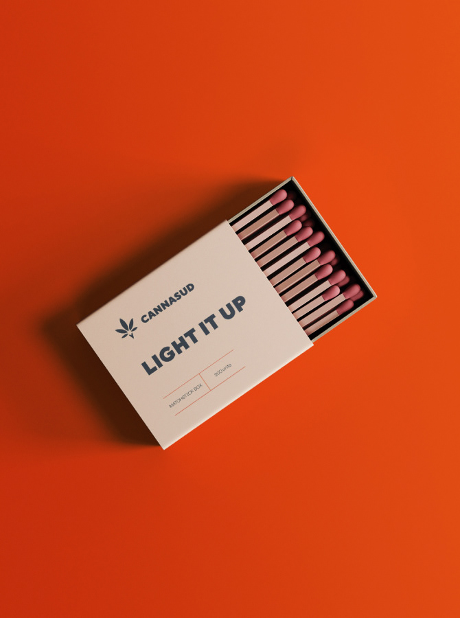
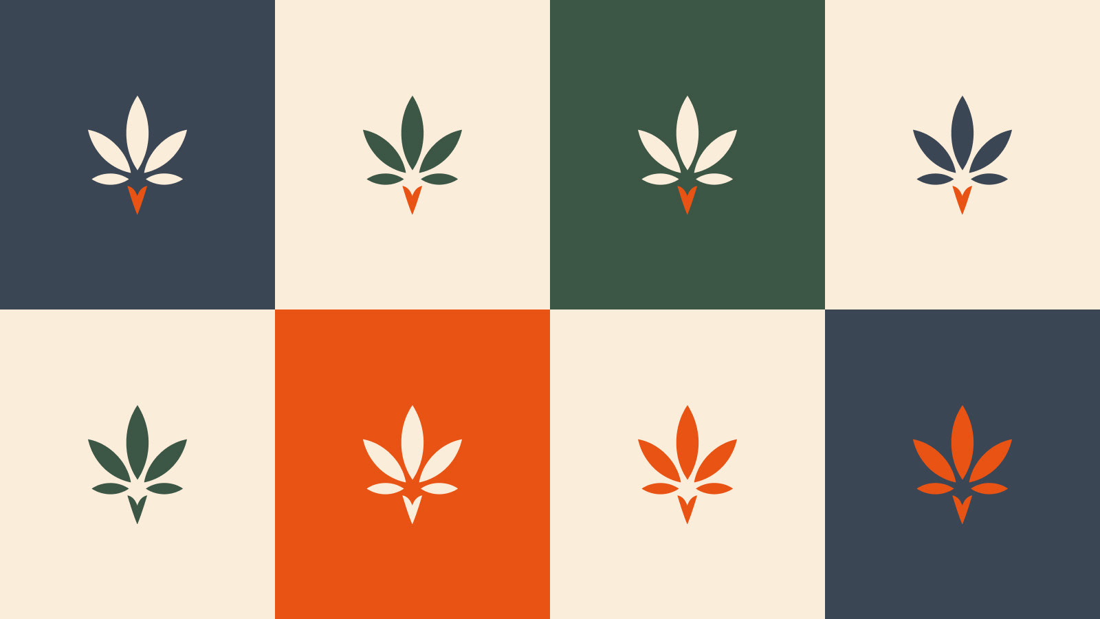
Brand Presence
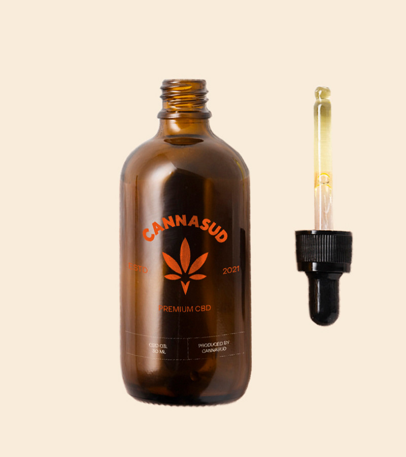
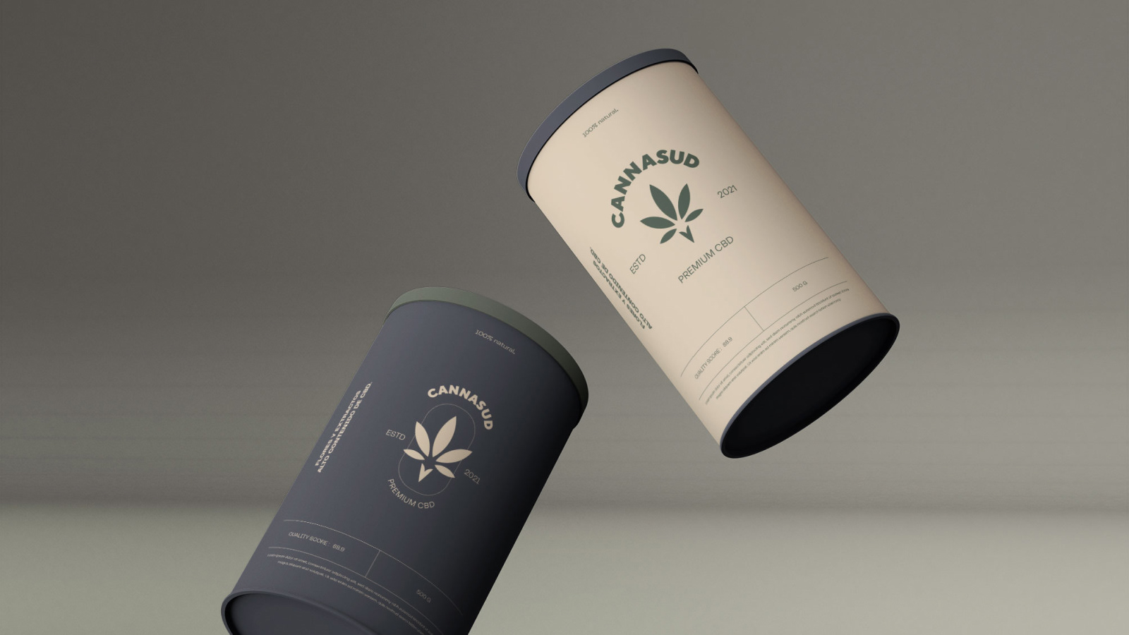
We always like our brands to work on a full spectrum of applications, that's why following this post you can see the branding working in different environments from a tiny application to a huge one.