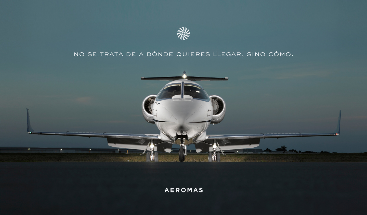
Aeromás Brand
Aeromás is an aviation company based in Uruguay. When they became partners with Southern Cross Aircraft (USA) a need for a re-brand surged. As we have already worked with SCA they felt 22DG was the right candidate for such a task.
SCA key brand element was a star, designed by us, so we felt that it was important to include it on Aeromás re-branding, that would tie them up. We kept as much as we could from their old brand while giving a refreshed new look with a reminiscence to the glowing new partnership.
Concept
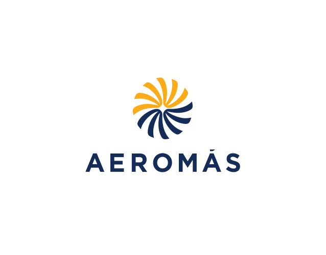
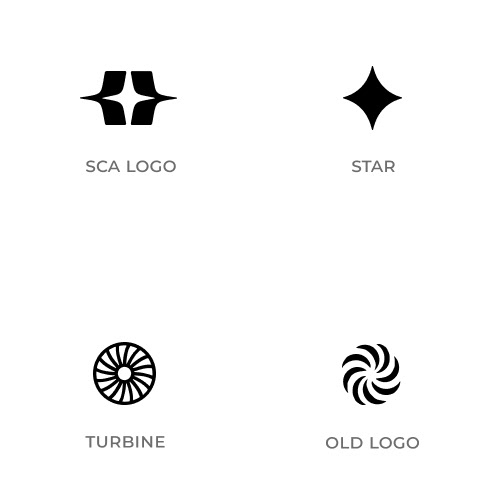
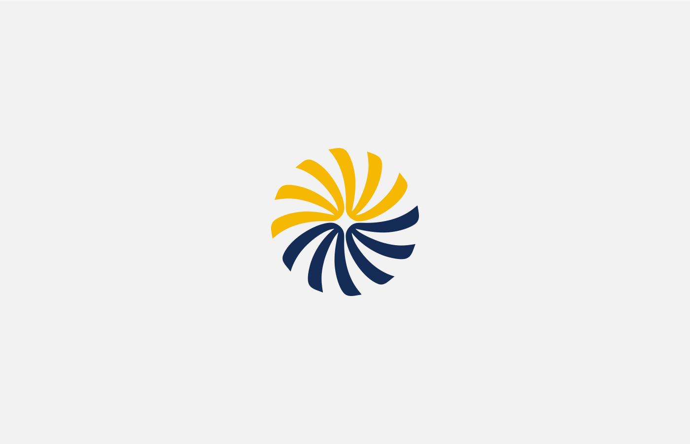
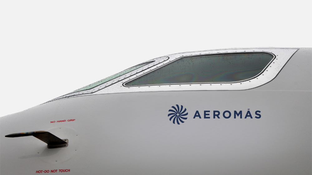
As stated above, the star was a key element from SCA logo which we felt necessary to merge in some interesting way with the old Aeromás brand.
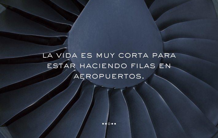
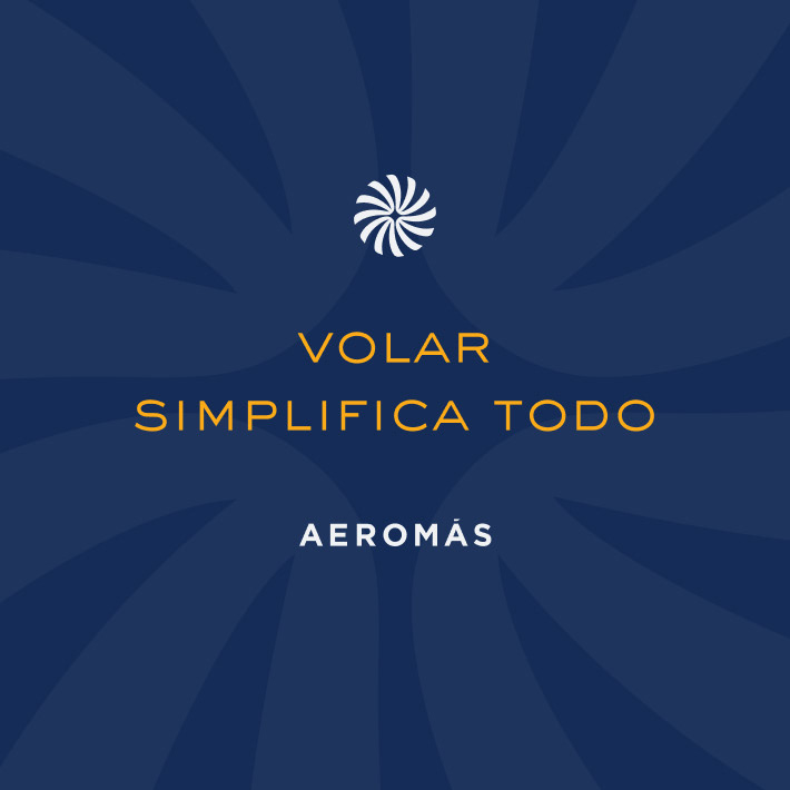
We kept the idea of a turbine but redesigned it in a way it's more useful for branding purposes such as 3D objects.
Our designers managed to compose the turbine from 4 mirrored identical parts which on their negative space form the protagonist star.

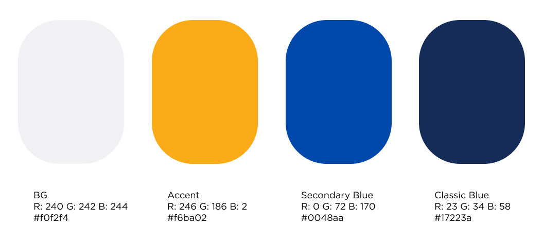
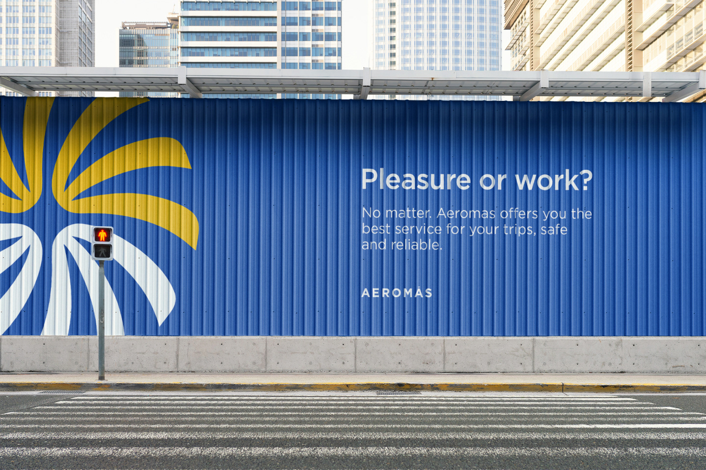
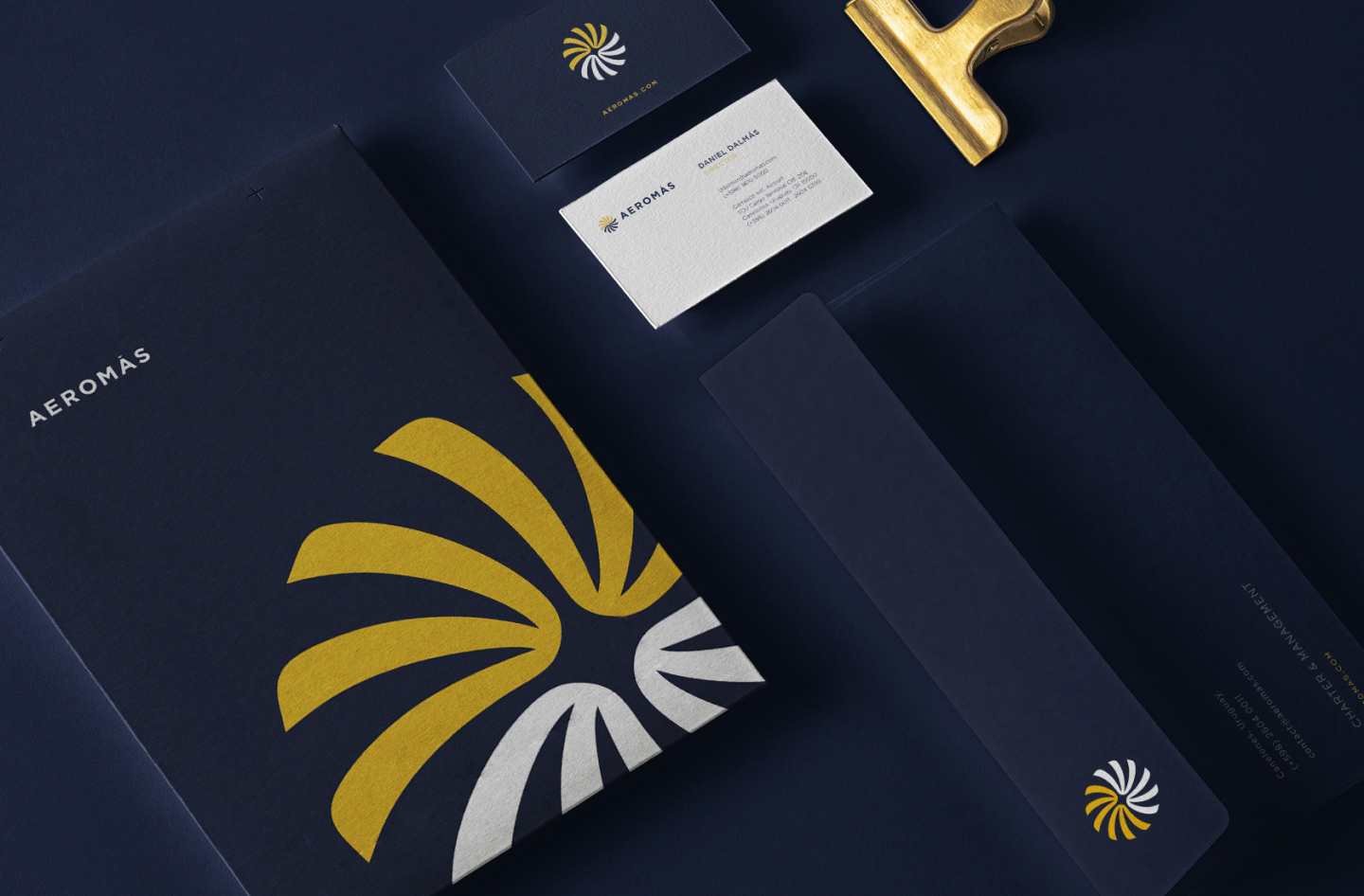
Color Palette
The color palette is a very crucial part of each identity, it's what keeps the brand unique. We didn't want to turn 180º and go in a different direction so we kept the Blue-Yellow pair but we managed to produce new tints.
We also created a secondary blue which has a more digital vibe to it so as to use it on digital platforms. This way, anything in print will use the classic blue, and digital stuff would use the secondary blue, but the pair yellow-blue is maintained so the identity remains intact and dynamic.
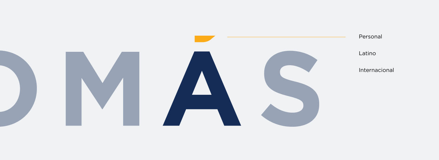
The accent on the letter A from Aeromás is a very distinct element so we exploited it. We felt that the accent is what gives them their "Latino" vibe as there are no accents on english language. Instead of using a regular accent we designed a unique one with an aviation reminiscence in it.
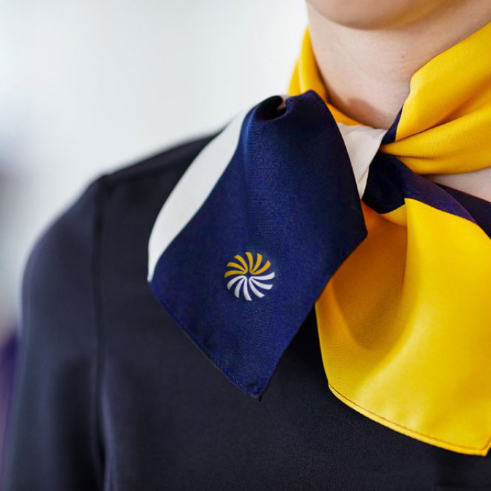
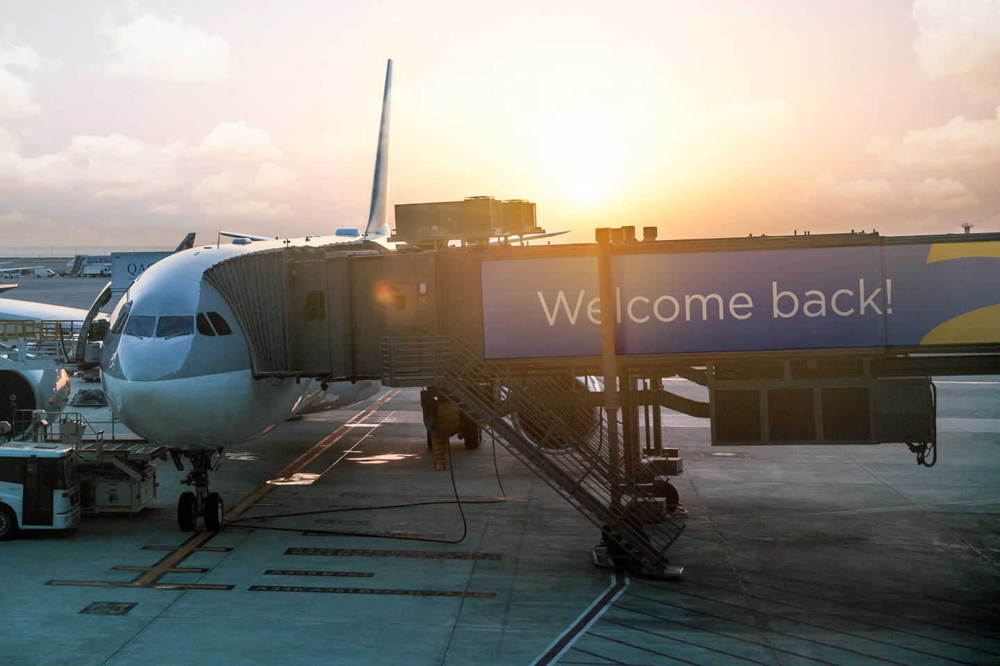
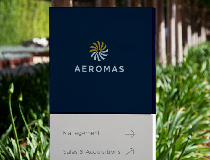
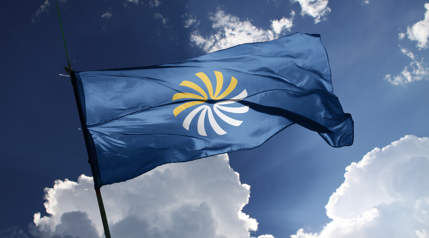
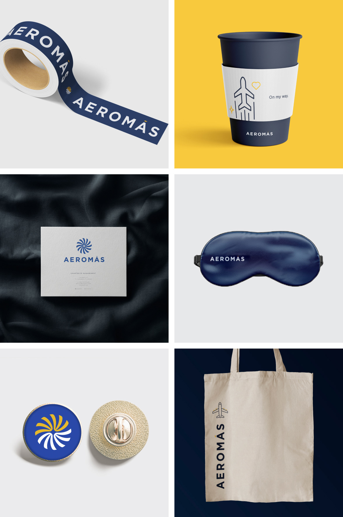
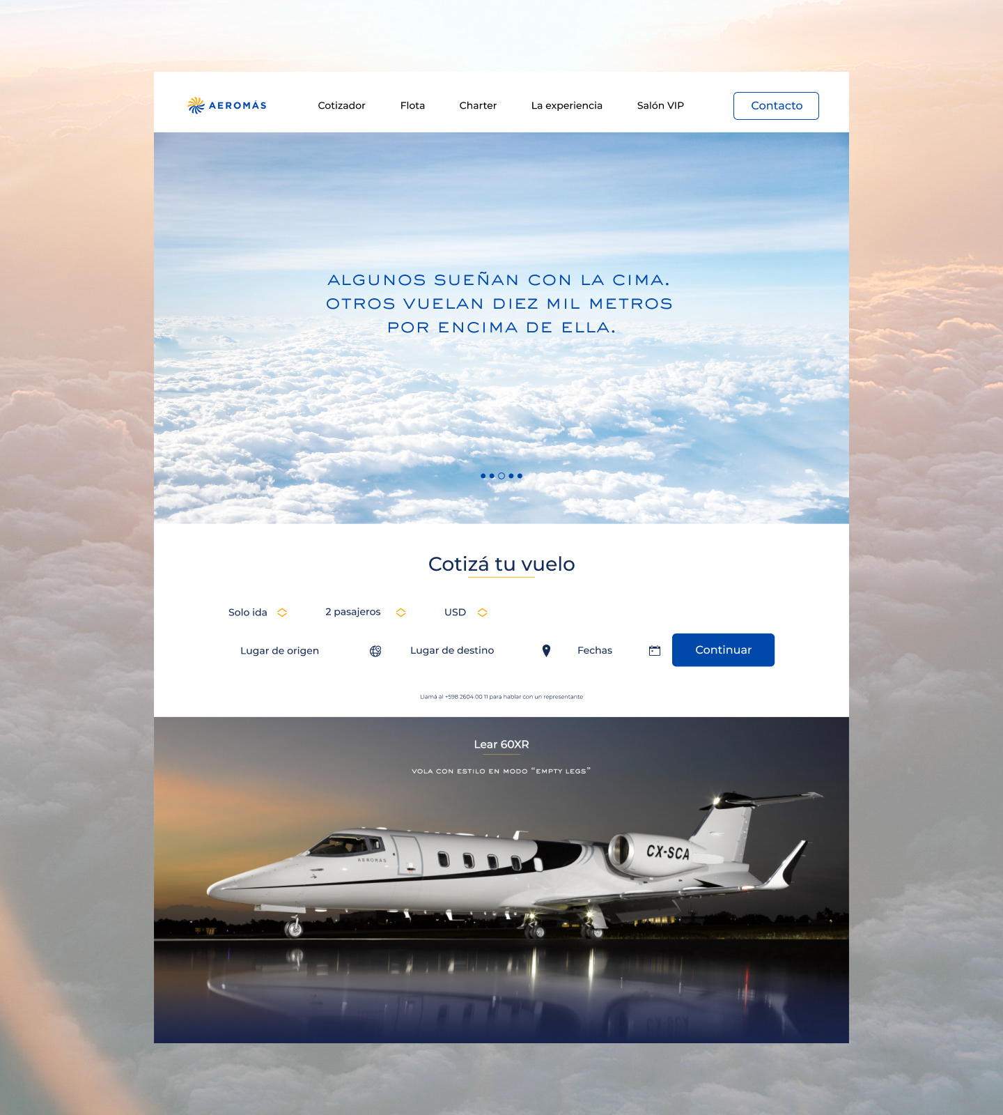
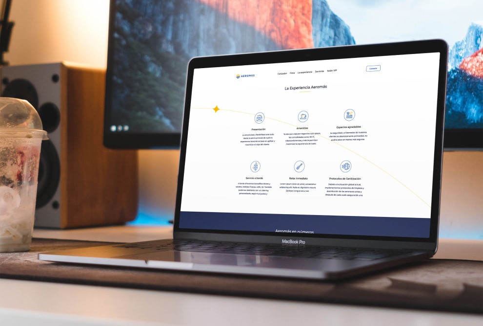
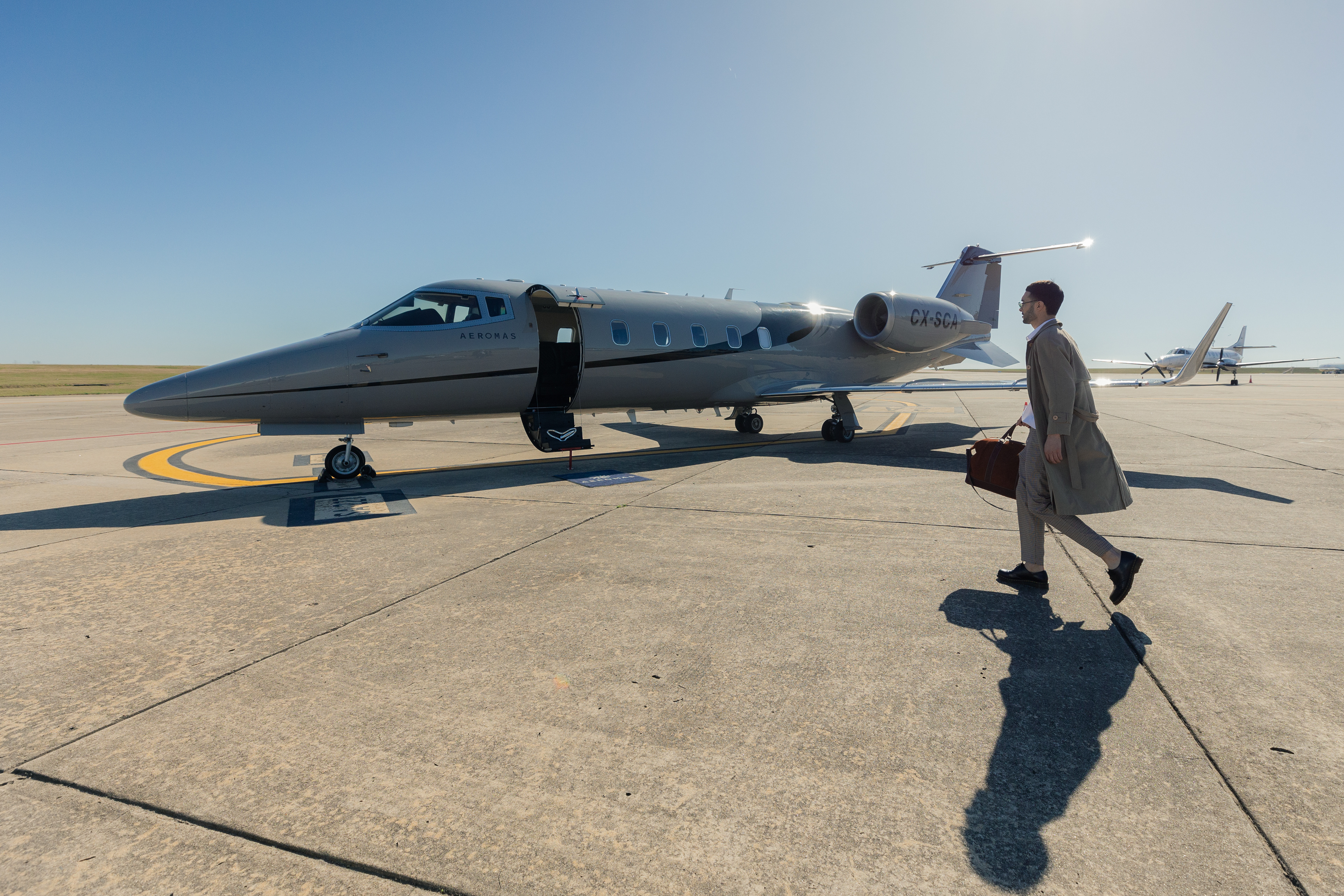
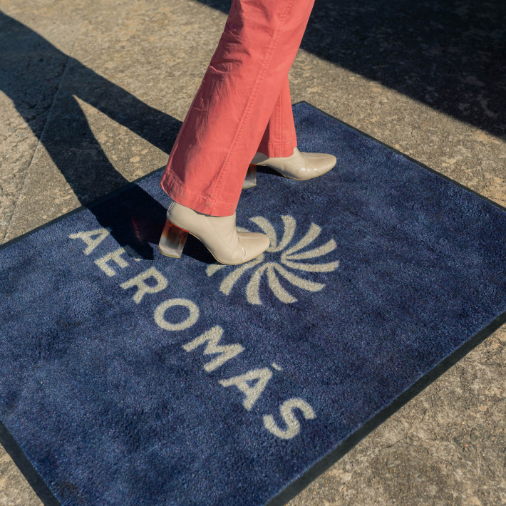
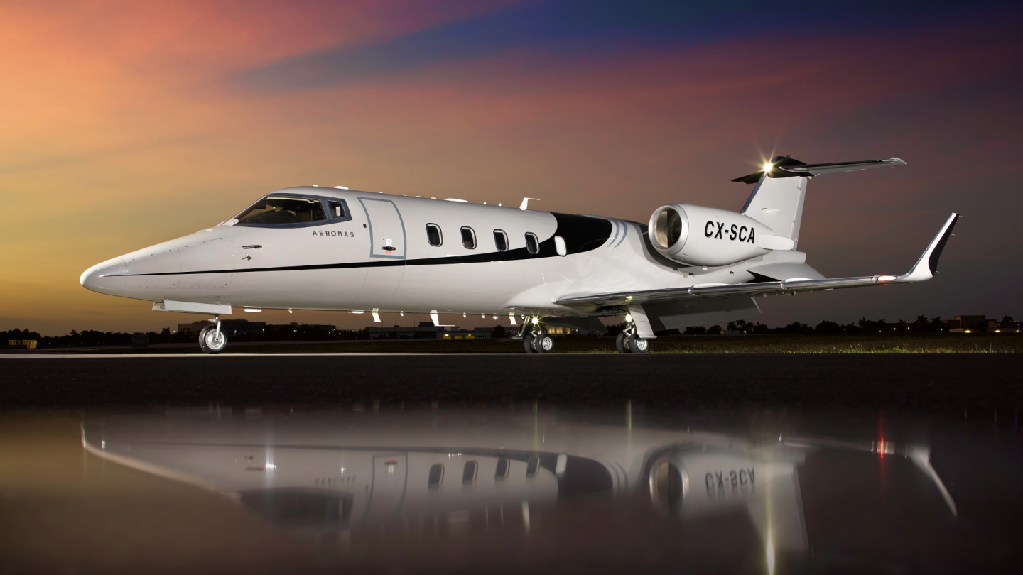
Brand Presence
At 22DG we feel that any brand must stand still in every possible application, being on big or tiny spaces, digital or print, 3D or flat, it must shine in every situation accomplishing a unique brand presence.
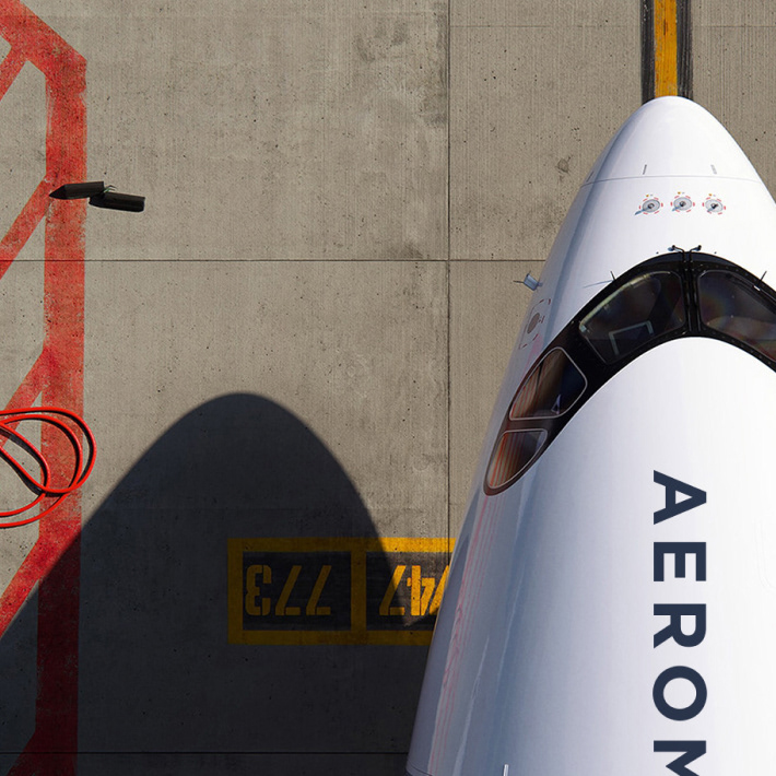
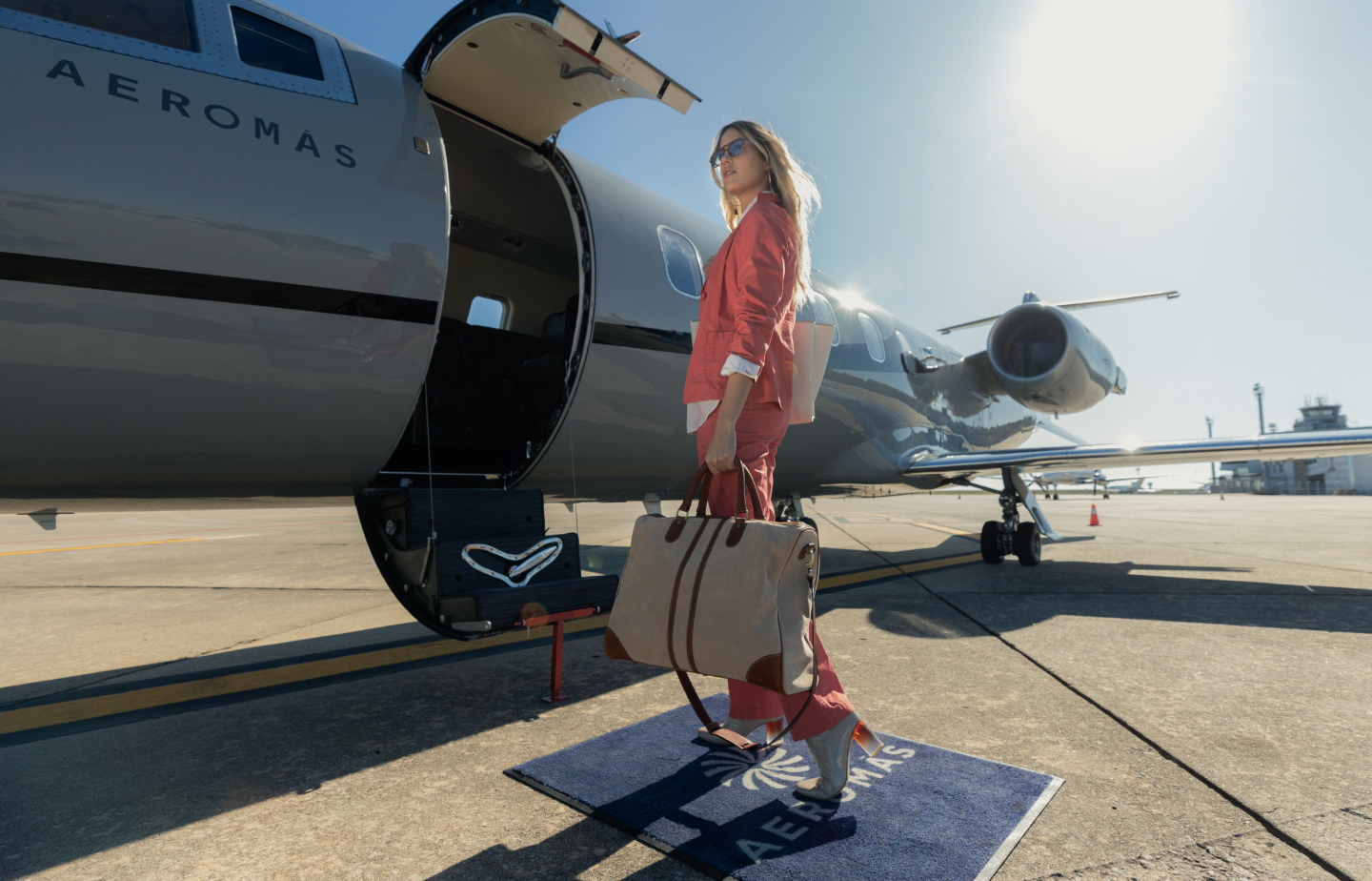
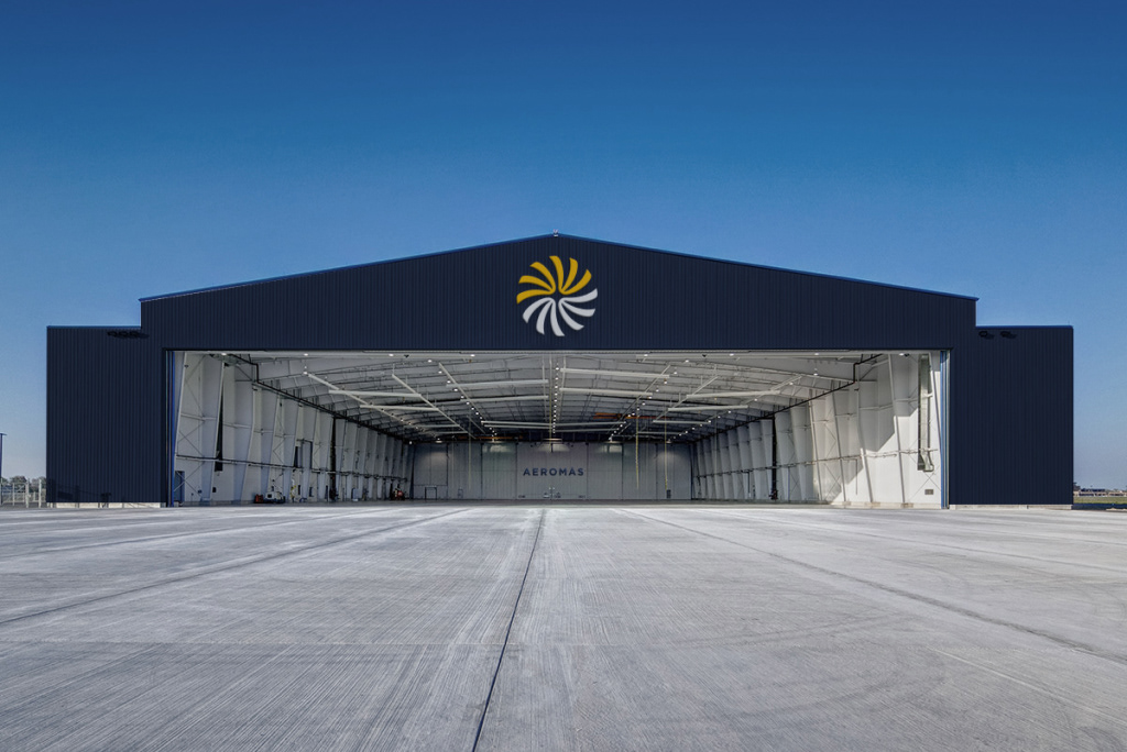
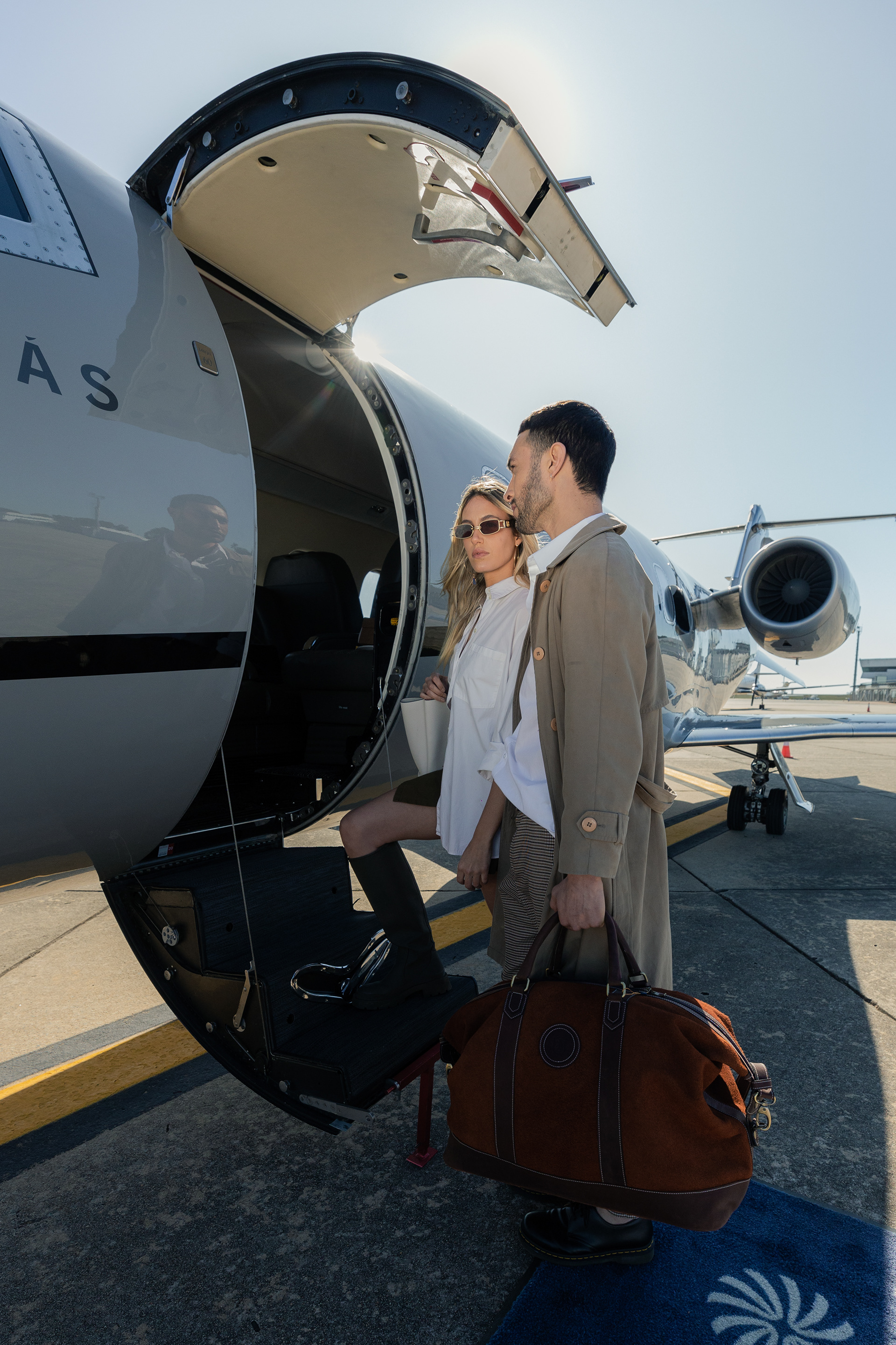
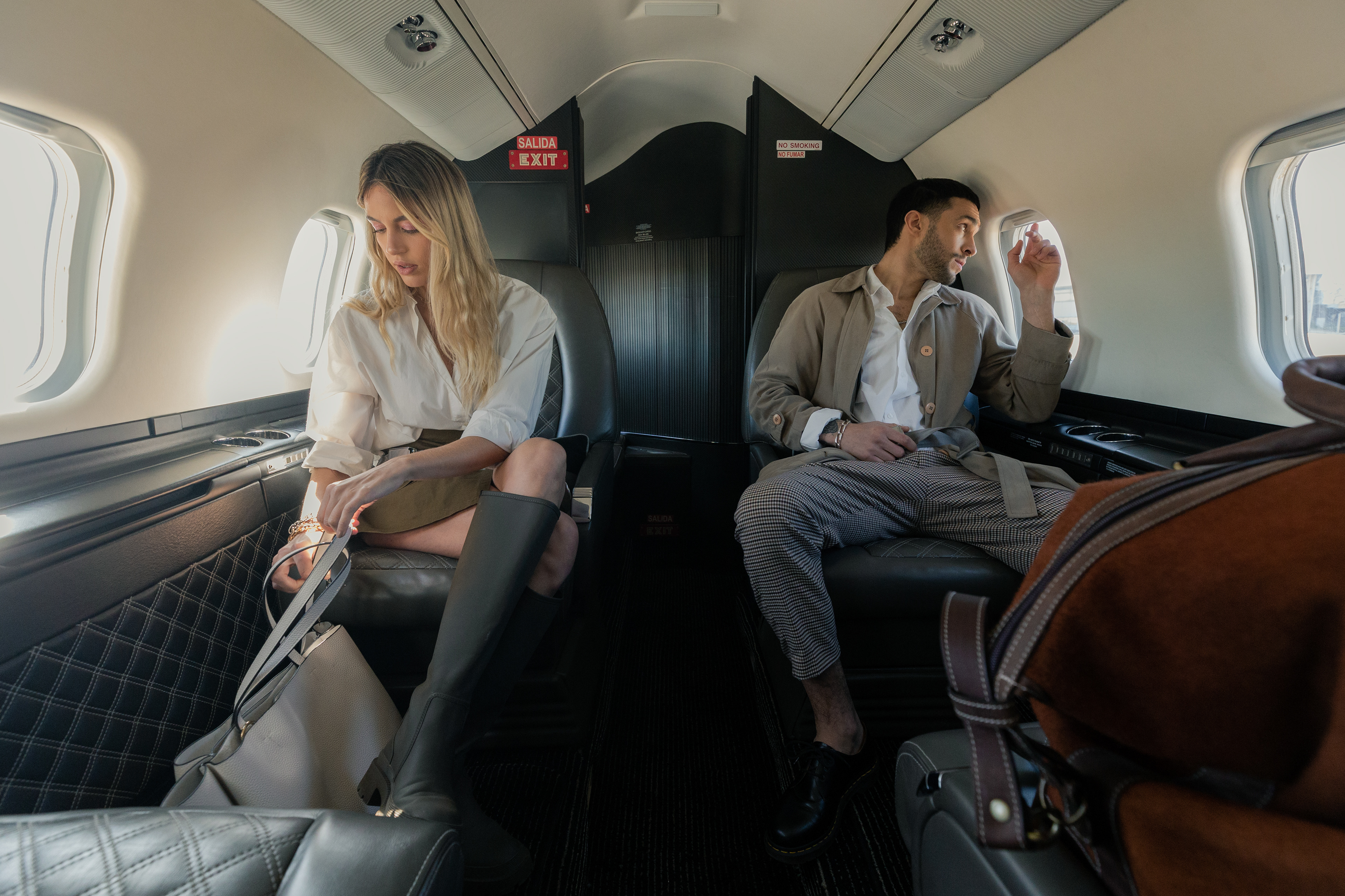
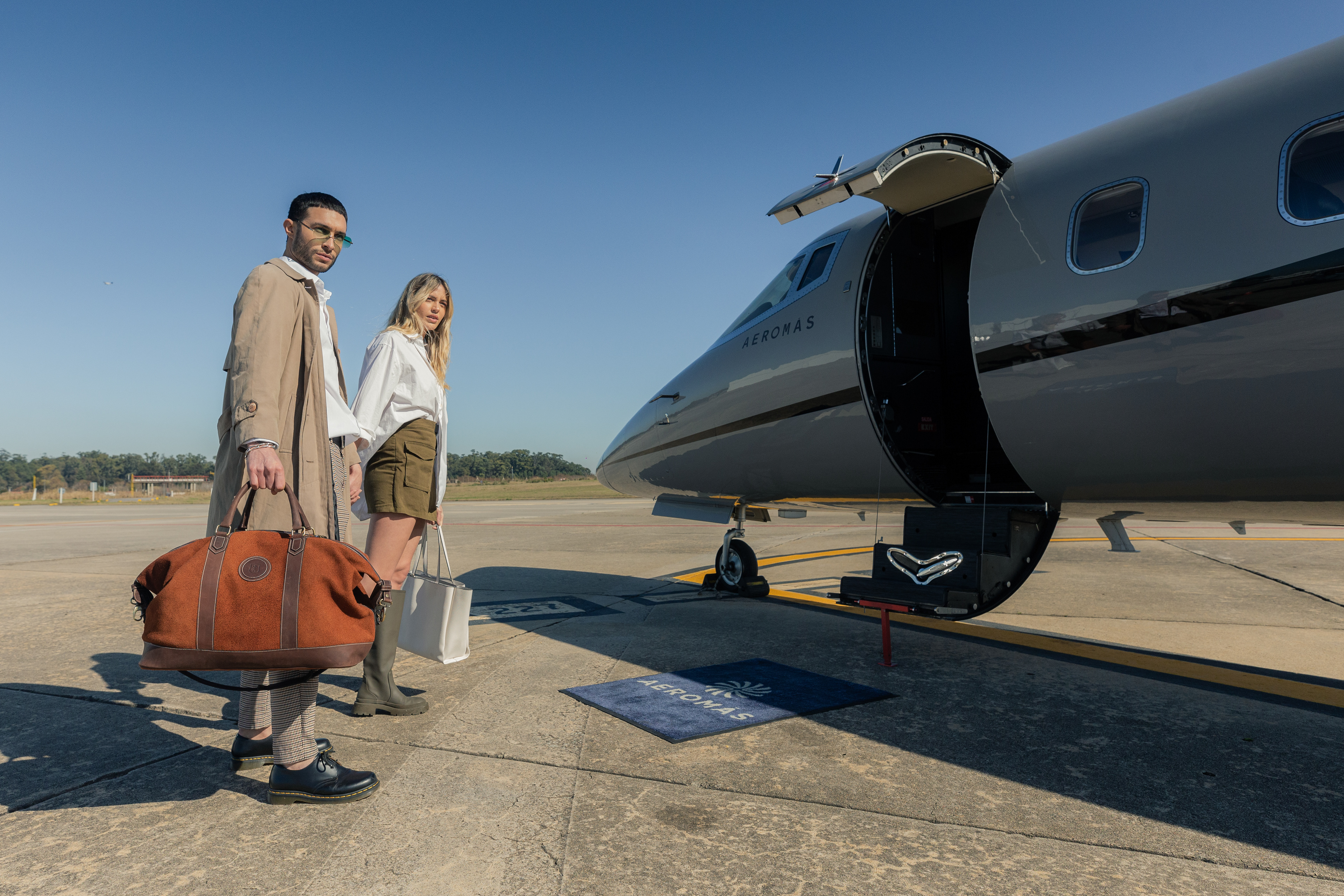
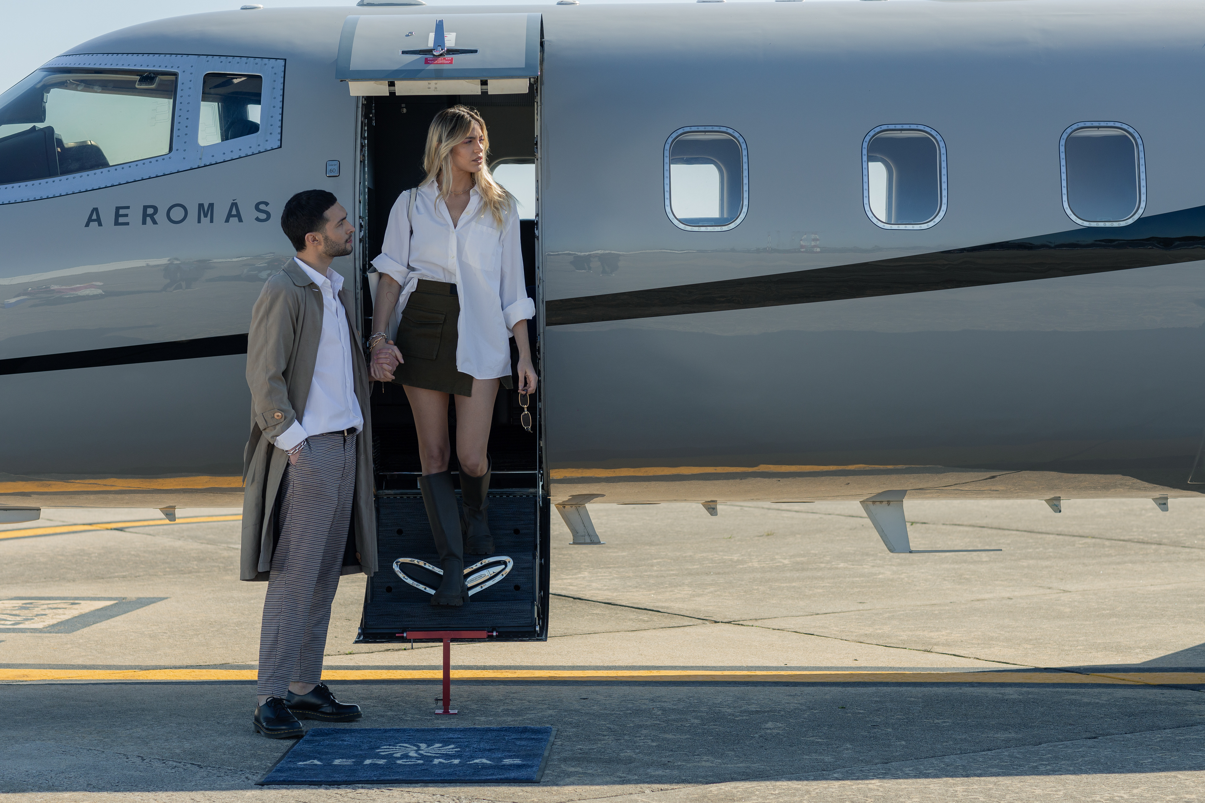
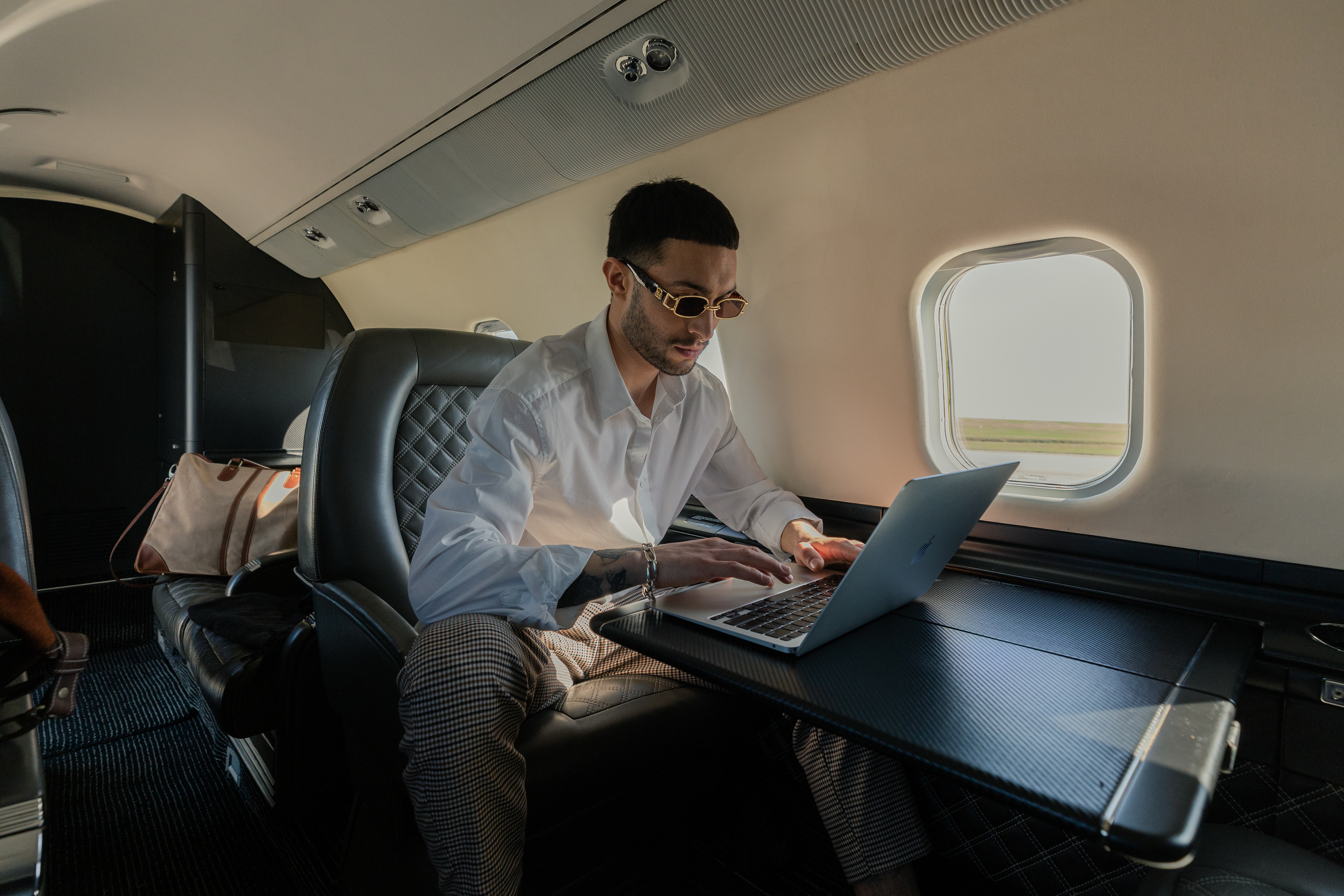
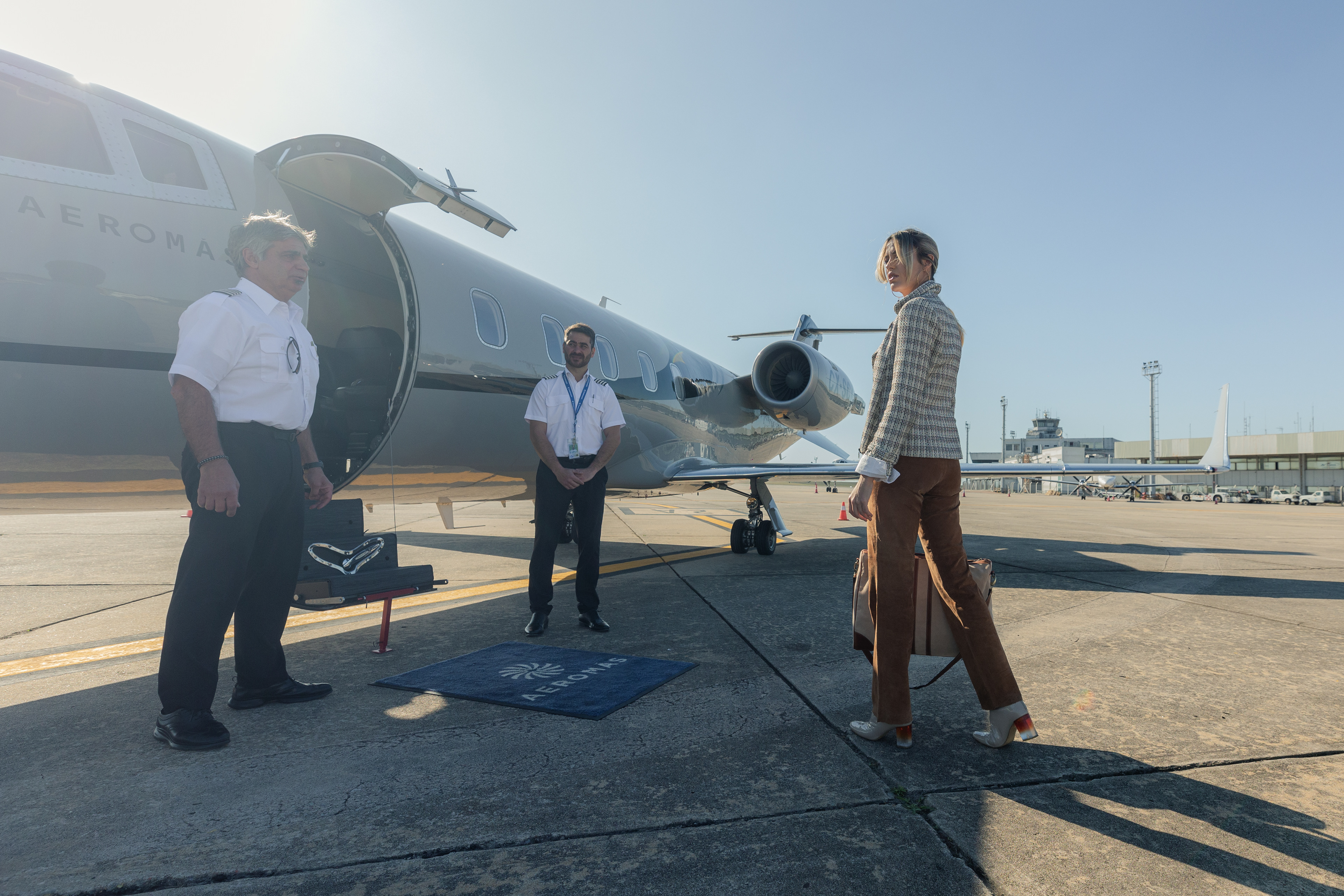
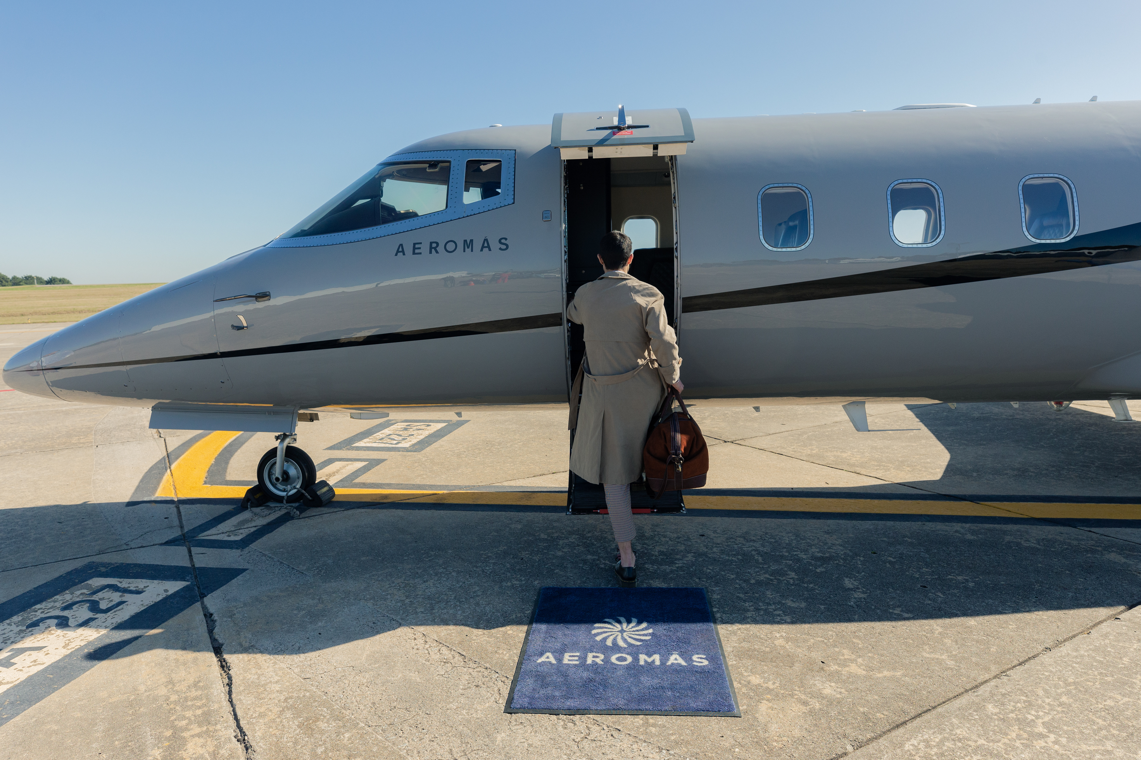
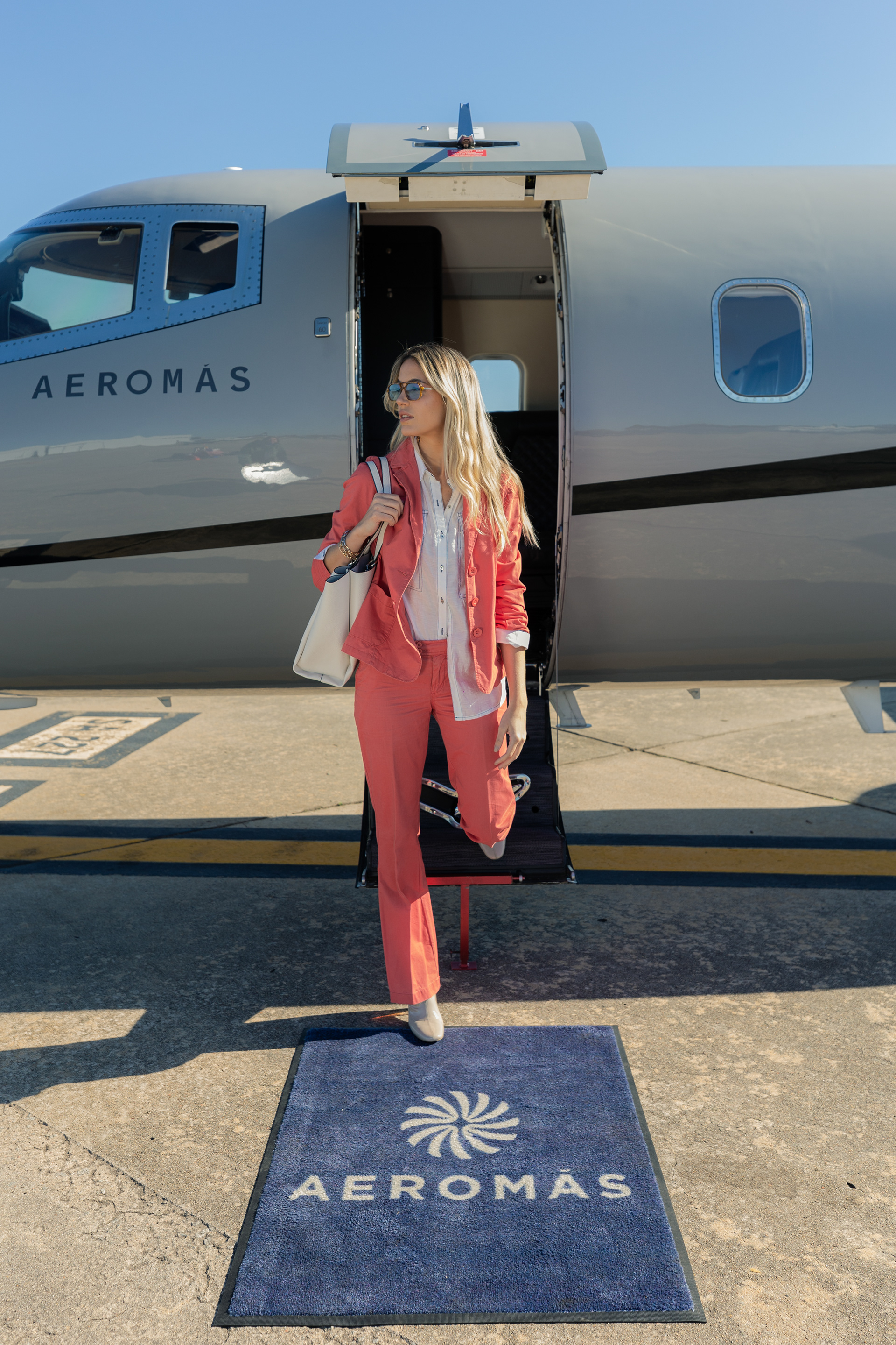
Scroll down and take a look at Aeromás brand being used in some offline real life examples.

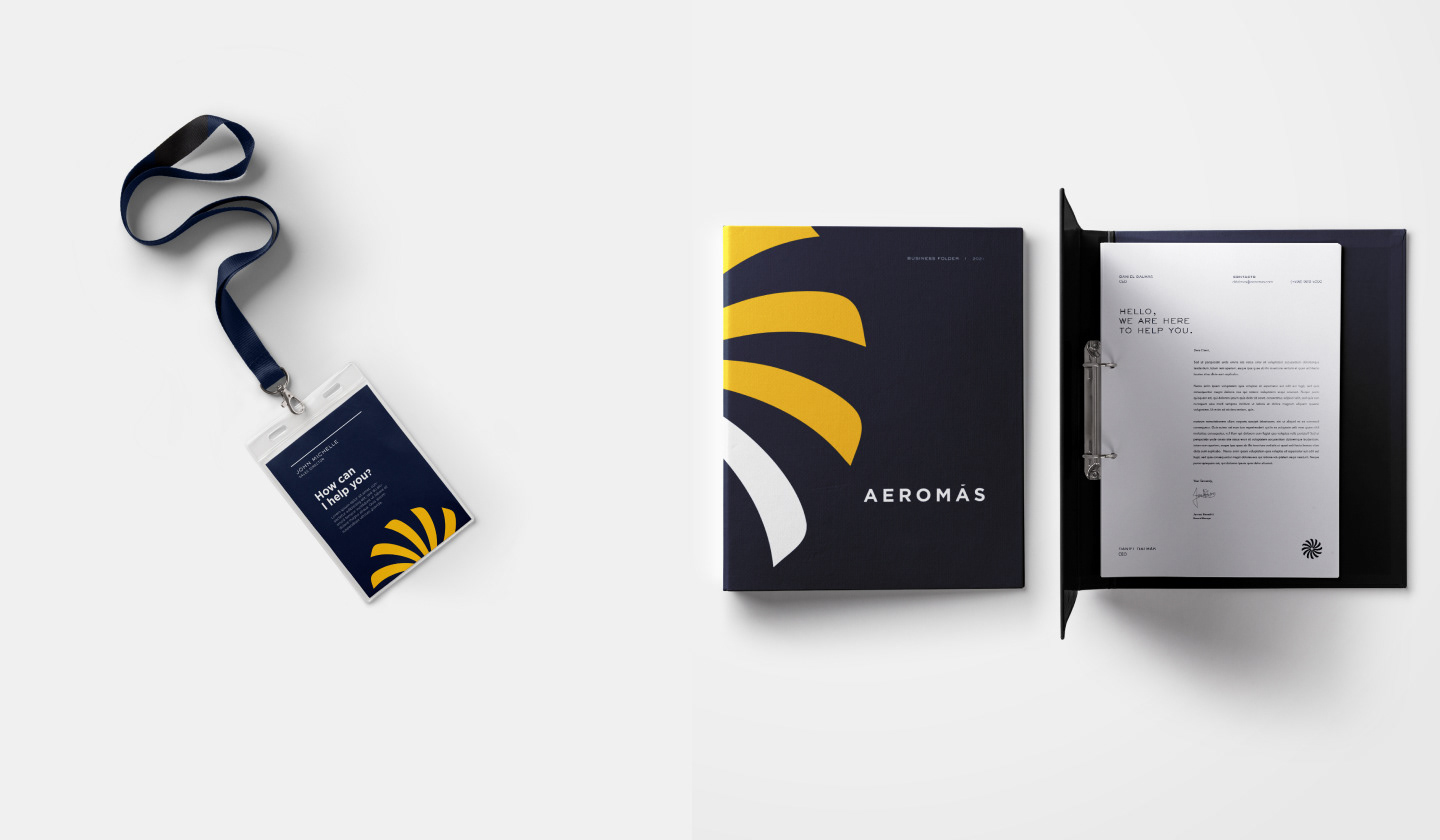
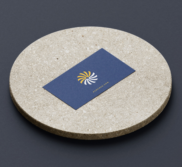
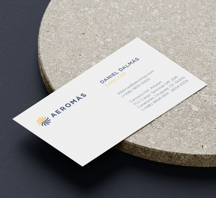
Stationery
For stationary purposes we use the classic blue from the color palette which gives the Aeromás brand an elegant and formal vibe.
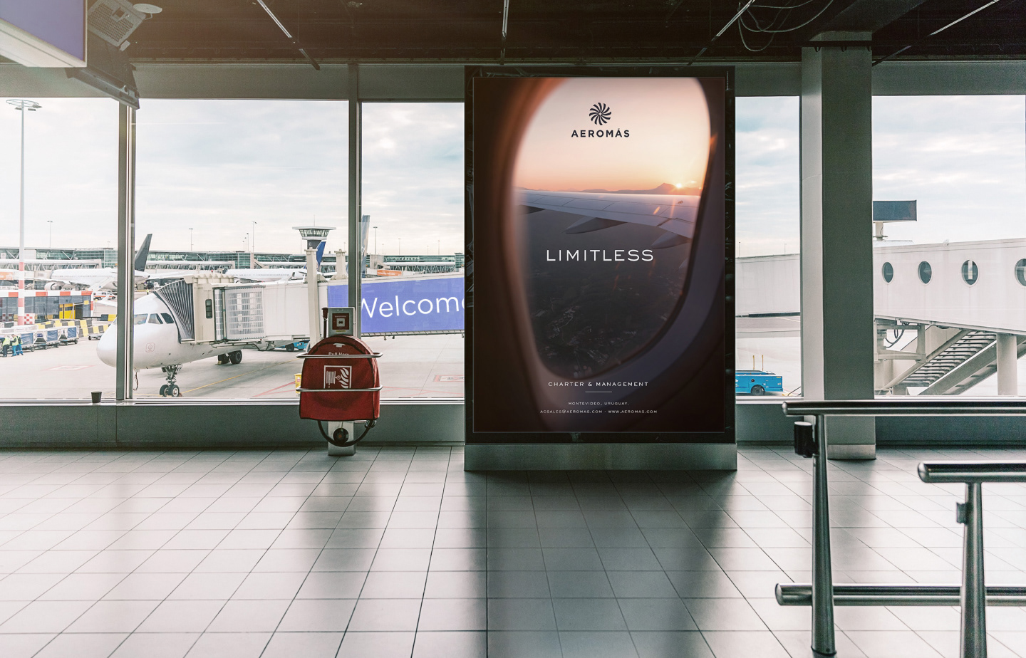
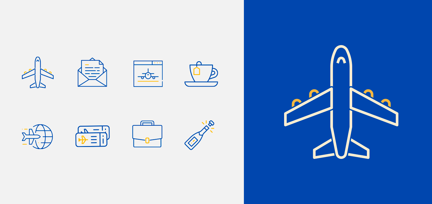
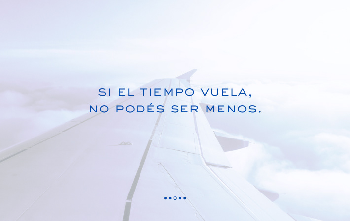
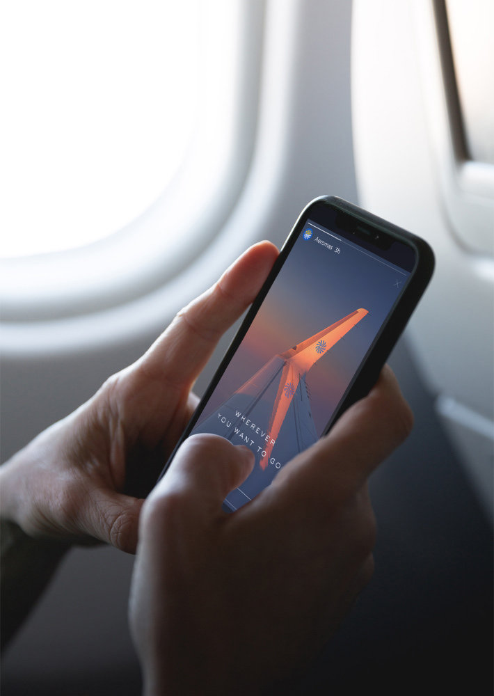
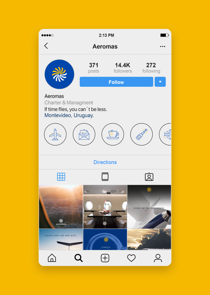
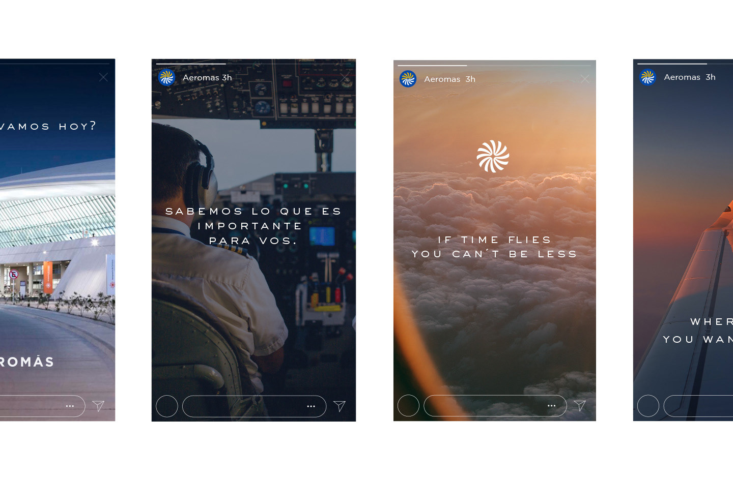
Digital
For digital and screen purposes the branding stands on the secondary blue from the color palette giving a more modern and electric vibe to it.


Thank You!